On mobile, can you please tell me the CSS to add spacing between the pricing columns here:
https://goalsarecool.com/join-academy/
Thanks!
Blake
On mobile, can you please tell me the CSS to add spacing between the pricing columns here:
https://goalsarecool.com/join-academy/
Thanks!
Blake
Hi there,
Giving direct CSS code for mobile related tweaks is easy but I would like to give some explanation on how you can do it yourself:
*Kindly read about using the Google Chrome Developer Toolbar usage: https://www.youtube.com/watch?v=Z3HGJsNLQ1E
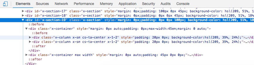
The main selector of the parent in CSS will be the x-section-19 as it is ID the code will b #x-section-19.
Columns inside have x-column class so the CSS selector of it will be .x-column.
The result of the selector:
#x-section-19 .x-column {}
https://www.w3schools.com/css/css_rwd_mediaqueries.asp
@media (max-width: 767px) {
#x-section-19 .x-column {}
}
Now the only thing you need to do is to add a margin bottom. So the final code will be:
@media (max-width: 767px) {
#x-section-19 .x-column {magin-bottom: 25px;}
}
Hope it helps.
Thanks @christopher.amirian!
I appreciate the information. However, trying to figure out which media queries will produce the desired results in different situations is the main issue I’m having.
It has been suggested that I use the following, but they don’t always produce the desired result.
/* Responsive text – all devices /
/ Smartphones (portrait and landscape) ----------- */
@media only screen and (min-device-width : 320px) and (max-device-width : 480px) {
}
/* Smartphones (landscape) ----------- /
@media only screen and (min-width : 321px) {
/ Styles */
}
/* Smartphones (portrait) ----------- */
@media only screen and (max-width : 320px) {
}
/* iPads (portrait and landscape) ----------- */
@media only screen and (min-device-width : 768px) and (max-device-width : 1024px) {
}
/* iPads (landscape) ----------- */
@media only screen and (min-device-width : 768px) and (max-device-width : 1024px) and (orientation : landscape) {
}
/* iPads (portrait) ----------- */
@media only screen and (min-device-width : 768px) and (max-device-width : 1024px) and (orientation : portrait) {
}
/**********
iPad 3
**********/
@media only screen and (min-device-width : 768px) and (max-device-width : 1024px) and (orientation : landscape) and (-webkit-min-device-pixel-ratio : 2) {
}
@media only screen and (min-device-width : 768px) and (max-device-width : 1024px) and (orientation : portrait) and (-webkit-min-device-pixel-ratio : 2) {
}
/* Desktops and laptops ----------- */
@media only screen and (min-width : 1224px) {
}
/* Large screens ----------- */
@media only screen and (min-width : 1824px) {
}
/* iPhone 4 ----------- */
@media only screen and (min-device-width : 320px) and (max-device-width : 480px) and (orientation : landscape) and (-webkit-min-device-pixel-ratio : 2) {
}
@media only screen and (min-device-width : 320px) and (max-device-width : 480px) and (orientation : portrait) and (-webkit-min-device-pixel-ratio : 2) {
}
/* iPhone 5 ----------- */
@media only screen and (min-device-width: 320px) and (max-device-height: 568px) and (orientation : landscape) and (-webkit-device-pixel-ratio: 2){
}
@media only screen and (min-device-width: 320px) and (max-device-height: 568px) and (orientation : portrait) and (-webkit-device-pixel-ratio: 2){
}
/* iPhone 6 ----------- */
@media only screen and (min-device-width: 375px) and (max-device-height: 667px) and (orientation : landscape) and (-webkit-device-pixel-ratio: 2){
}
@media only screen and (min-device-width: 375px) and (max-device-height: 667px) and (orientation : portrait) and (-webkit-device-pixel-ratio: 2){
}
/* iPhone 6+ ----------- */
@media only screen and (min-device-width: 414px) and (max-device-height: 736px) and (orientation : landscape) and (-webkit-device-pixel-ratio: 2){
}
@media only screen and (min-device-width: 414px) and (max-device-height: 736px) and (orientation : portrait) and (-webkit-device-pixel-ratio: 2){
}
/* Samsung Galaxy S3 ----------- */
@media only screen and (min-device-width: 320px) and (max-device-height: 640px) and (orientation : landscape) and (-webkit-device-pixel-ratio: 2){
}
@media only screen and (min-device-width: 320px) and (max-device-height: 640px) and (orientation : portrait) and (-webkit-device-pixel-ratio: 2){
}
/* Samsung Galaxy S4 ----------- */
@media only screen and (min-device-width: 320px) and (max-device-height: 640px) and (orientation : landscape) and (-webkit-device-pixel-ratio: 3){
}
@media only screen and (min-device-width: 320px) and (max-device-height: 640px) and (orientation : portrait) and (-webkit-device-pixel-ratio: 3){
}
/* Samsung Galaxy S5 ----------- */
@media only screen and (min-device-width: 360px) and (max-device-height: 640px) and (orientation : landscape) and (-webkit-device-pixel-ratio: 3){
}
@media only screen and (min-device-width: 360px) and (max-device-height: 640px) and (orientation : portrait) and (-webkit-device-pixel-ratio: 3){
}
Also, the code you provided did not work.
Hi There,
Sorry there is just a bit syntax error on the CSS code provided, it should be:
@media (max-width: 767px) {
	#x-section-19 .x-column {
		margin-bottom: 25px;
	}
}
The columns start stacking when the screen width is 767px and below, so the right media query should be @media (max-width: 767px)
Thanks,
Hi there,
You can add the CSS code below to have a Padding at the left and right side of the page:
@media (max-width: 767px) {
.x-main.full {padding: 0 15px;}
}
Hope it helps.