Column spacing for mobile

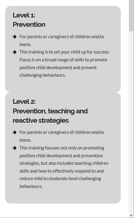
I’m creating a layout that uses a 3-column row, each of those columns has a gray background colour and rounded corners. They space out perfectly for larger displays but when viewed on mobile there is now space between the “columns” top to bottom. This leaves them looking like a tall gray, notched column. I’ve played with all of the settings I can think of and can’t find a way to create space. The individual columns themselves have no margin controls in cornerstone… I’m sure this is a simple problem but I desperately need a solution.

Thanks

Hello @ryancreates,

Thanks for asking. :slight_smile:

Can you please give us website access and exact page URL in a secure note as I checked the URL that’s attached to licence and I see a under-construction page?

Thanks.

Secure note sent. If I need to repost this from the other account I will do so.

Hi There,

Thanks for writing in! Could you please try adding the following CSS rule into your Theme Options > Global CSS area and see if that helps.

@media(max-width:480px){
  .home .x-column {
    margin-top: 5px;
  }
}

Hope that helps.

that fixes the issue with the homepage but none of the other pages…

Here’s what they look like. Ideally there would be space between the grey columns

This may be more helpful

Hi There,

Could you please update the above provided code as follows and see if that helps.

@media(max-width:480px){
  .x-column {
    margin-top: 5px;
  }
}

Hope that helps.

That did the trick. Thanks!