Column Spacing, Diagonal Lines, & Transparency

Hi,
I have a few problems that I need assistance with. I’m using the ethos theme.

1.) 3 Column Spacing Issue: I have a section with 3 columns it looks fine however, on mobile the are huge gaps between the three columns. Please see the image attached.

2.) Diagonal Lines: I have diagonal lines on a page using the separator. One problems there is an overlap. How to I remove the overlap and hide the section behind the diagonal line. See image attached.

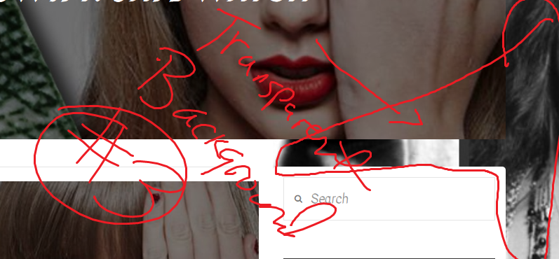
3.) Transparency: So, I have my site transparent using this css code

.page-template-template-blank-4-php .x-main, .page-template-template-blank-5-php .x-main, .page-template-template-blank-6-php .x-main, .page-template-template-blank-8-php .x-main, .site {
background-color: transparent;
}

My problems with this is that my blog page and post page backgrounds are transparent. Any suggestions on how to fix this? I would like the backgrounds white. See the image attached.
Thanks

Hi There,

Please do share page URL for each issue so we can check directly. Is this your site: https://internetideators.com? I am not sure which page is in question for each issue. Also, for #3, you mean to negate those custom CSS for blog and post pages? Please clarify. Thank you.

I added a secure note. Please let me know if you need anything else.

Hi There,

In that case we also need the login credentials.

Thanks

Please see the secure note attached. I also have one other issue. There was preinstalled content css that I cant seem to delete on my home page. I try to delete it but it keeps coming back. Any ideas why it’s not deleting? I can always recreate the page to remove it but I’d rather solve the issue.

Hello There,

Thanks for writing in!

1.) I have viewed almost all of the pages in your site. I could not find this page in question so I wasn’t able to inspect and figure out how to resolve this gap issue.

2.) This is not actually an overlap. This is a result of the background color because you were using a semi transparent background color. Please change it to a solid background color.

3.) To resolve this issue, please add the following CSS code in the X > Theme Options > Global CSS (http://prntscr.com/evui3r)

.x-content-sidebar-active .x-container.main:before {
    right: -50em;
}

We would loved to know if this has work for you. Thank you.

The gap issue appeared on the first page (Home Page). When I put it in mobile view the gap occurs. Please assist

Also I need help changing the header background to white. It’s also transparent. Check my forum page.

Hey There,

To resolve your gap issue in smaller screens, please add the following CSS code in the X > Launch > Theme Options > Global CSS (http://prntscr.com/evui3r)

@media(max-width: 979px){
  .h-custom-headline.cs-ta-center.h3 {
    margin-top: 0 !important;
    padding-top: 1.15em;
  }
}

And to change the background color of your header into a solid color, you can make use of this code:

 .x-navbar{
    background-color: rgba(24, 21, 21, 1);
}

Hope this helps. Please let us know how it goes.

This topic was automatically closed 10 days after the last reply. New replies are no longer allowed.