When our website is opened on smaller devices the columns become long and width is really close. How can I set the width and height shown in the example below? When everything becomes long and small width the columns overlap.
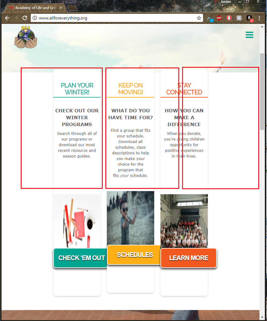
When our website is opened on smaller devices the columns become long and width is really close. How can I set the width and height shown in the example below? When everything becomes long and small width the columns overlap.
Hi There,
Please try adding this custom CSS under X > Theme Options > CSS:
@media (min-width: 768px) and (max-width: 1024px){
    .home #x-section-2 .x-container {
        width: 95%;
        max-width: 100%;
    }
}
Hope it helps 
This topic was automatically closed 10 days after the last reply. New replies are no longer allowed.