Hi,
The styling for these two columns is identical, but on desktop, the second column is squished all the way to the right. It looks ok on mobile but I’m guessing it’s also not working on iPad.
Here is a screenshot of the live page:
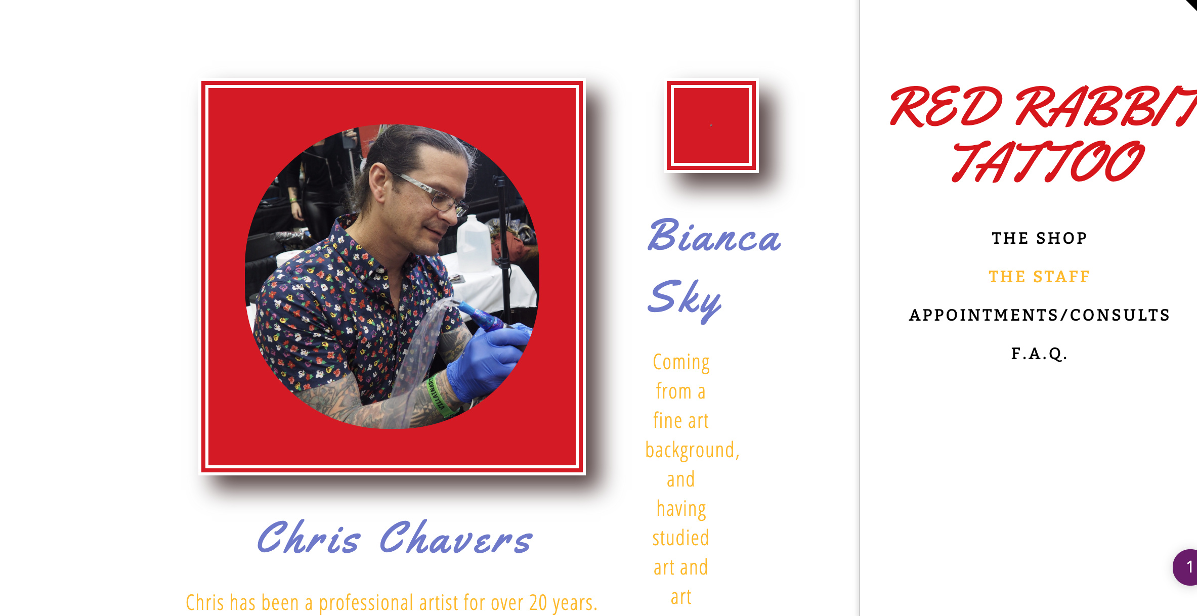
In Cornerstone, they are side by side and all of the styling lines up.
We’ve looked into it pretty extensively and can’t figure out what the issue may be.
Thanks in advance for your help!