On our town page https://edertal.de running with Pro 3.1.2 we have the problem that on Safari (both on iPad and MacOS) we have display issues with the navigation. On Firefox and Chrome everything is fine and you can scroll through everything that isn’t visibl anymore, and smaller devices like iPhone get a Shiftnav navigation anyway.

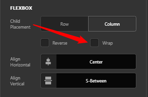
The navigation is on a left side header. As the space used by the navigation is on normal 100% zoom is more than it is available, the text above the navigation is in one column, the navigation itself is on a second column and not really usable for visitors. When I use on MacOS the CMD-Minus command to zoom out, it will slide back to one column as there is now enough space, but as soon as I open a submenu and the resulting needed space is more than available, it will slide again to two columns.

I tried to debug it with the Safari developer tools but didn’t find any CSS value that was responsible for this behaviour. Also tried the search function, but didn’t find anything on this specific behaviour.