Close up button inside the dropdown menu

Hi!

I have a few questions:

  1. I am trying to find out how can I put the X to close up the menu dropdown, inside the menu dropdown in for phone devices. Could you let me know how to do it?

This is how it looks at the moment:
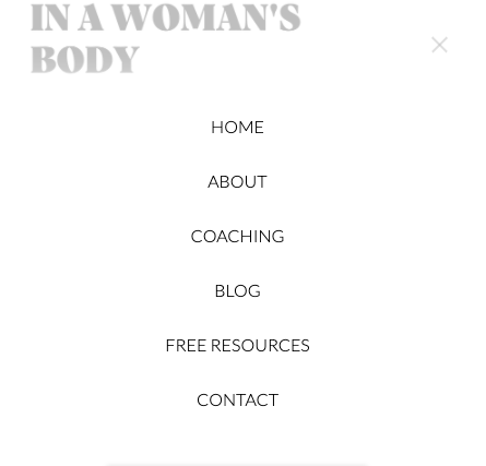
Screenshot 2020-06-13 at 22.04.35

  1. I would like to know how can I add a button in the menu dropdown. I would like to add this a button that says: book a session, below the words Contact, for mobile devices. But I cannot find a way to do it.
    Could you help me out?

  2. I would like to make my logo smaller for phone devices as it looks way too big, is there a way to do this?

Best regards,
Marina.
Hello Marina,

Thanks for posting in!

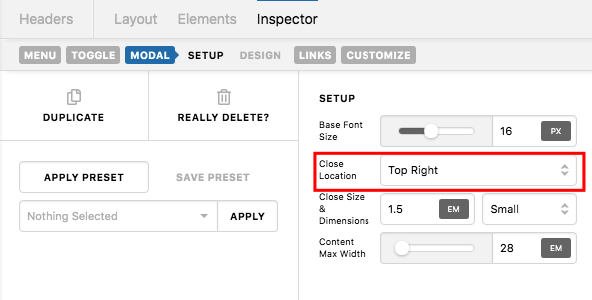
1.) The location of the close button can only be in the Top Right, Top Left, Bottom Right or Bottom Left.

plP8oYtOSyqD9yWJDx9wmA

Reposition the close button will require modifications and custom coding which is beyond the scope of our support already.

2.) If you need more elements for the mobile navigation, I would recommend that you use Content Area Modal element instead of using the current navigation modal element. With Content Area Modal, you can simply go to Pro > Global Blocks, create a block that has your logo, menu and custom button that you need. You can then use the global block shortcode and insert it in your Content Area Modal which will serve as your mobile navigation.

3.) If you will follow my suggestion in #2 then this can be covered.

Hope this makes sense.

This topic was automatically closed 10 days after the last reply. New replies are no longer allowed.