Hey Dave,
The Classic Prompt element was not designed to be used in a 2 or multiple column setup. I’d strongly recommend that you separate the Classic Prompt and the Image element into rows because imagine even if your drop the button down, it would still not look balanced.
If you wish to continue with that setup, you would need to duplicate the row containing the prompt and image and then hide the row in tablet view.
You’ll then need to create a new row within the same section and move your image to the new row and set the row with the prompt to a single column row. Hide these rows in Desktop, Laptop, and Phone views. They should show only in tablet in place of the first row.
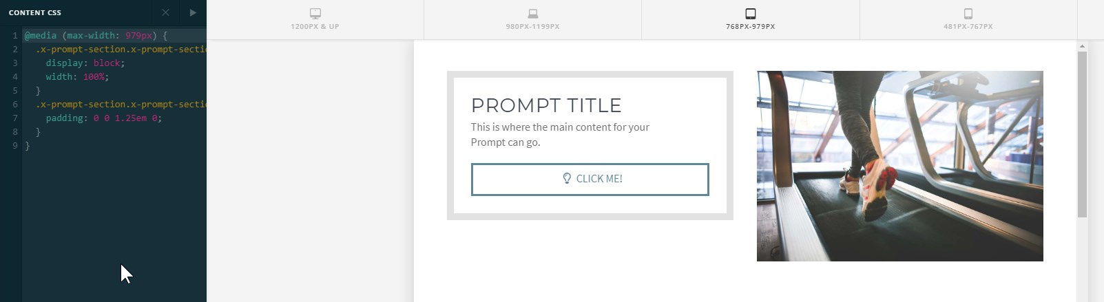
It is possible to make the button dropdown earlier in tablet view using custom CSS and I’ll show you an example but please note that we will not be fixing issues that might result from the use of custom code nor we could provide enhancements for it.
Here’s the code that should be added in the Content CSS of the page.
@media (max-width: 979px) {
  .x-prompt-section.x-prompt-section-message, .x-prompt-section.x-prompt-section-button {
    display: block;
    width: 100%;
  }
  .x-prompt-section.x-prompt-section-message {
    padding: 0 0 1.25em 0;
  }
}
That will drop the button down starting from the tablet view instead of starting from phone.
Hope that helps.


