Hi Team X,
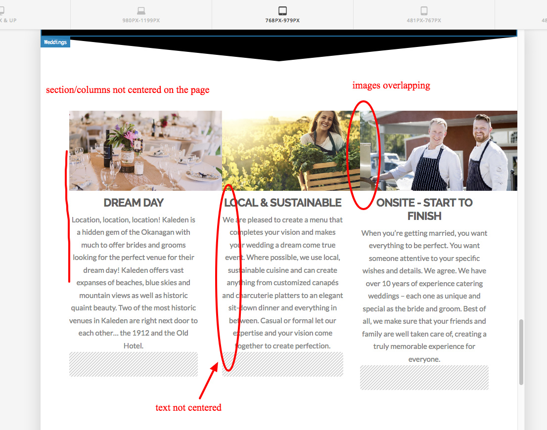
Struggling a little with the Classic Feature Box images and alignment on an ipad sized screen.
If I have the width of the image set to the same as the column everything looks centered on the screen and with the text below until on the medium screen size - then the images start to cover each other and the text is pushed to the left side even thought it is still center aligned in format.
desktop and iphone both look great, though I would like the images and to be larger on the big screen.
Can the images in these Classic Feature Boxes be responsive to screen size? Did I miss a setting?