Classic custom headline issue in cornerstone

I’m seeing an issue with the classic custom headline but only in cornerstone.

When I view our live website, it looks just fine.

See the following screenshot:

I basically have two classic custom headlines stacked one on top of the other.

The first headline in cornerstone is identical to the live website.

The second headline in cornerstone is not shrinking down in size as it does when viewing it on the live website.

This used to work in cornerstone without any problems but now it’s not.

How can this be fixed?

Hello Aaron,

Thanks for asking. :slight_smile:

Please follow up the steps below:

  1. Ensure everything is up to date according to our version compatibility list here. Please follow the best practices when updating your theme and plugins. Click here for more information.
  2. Go to X > Settings and click on the Clear Style Cache button.
  3. If you’re using a CDN, please clear the CDN’s cache and disable optimization services.
  4. Test for a plugin conflict. You can do this by deactivating all third-party plugins, and see if the problem remains. If it’s fixed, you’ll know a plugin caused the problem, and you can narrow down which one by reactivating them one at a time.
  5. Remove custom CSS and Javascript from the options or Child Theme and test the case.

If you still have problems kindly get back to us with the result of the steps above and URL/User/Pass of your WordPress dashboard using the Secure Note functionality of the post to follow up the case.

Thank you.

Hello,

That did not work.

I’ve attached the details.

Hi Aaron,

I just tried this on the latest versions of X theme and cornerstone(same as yours) and it’s not happening. It was also added to our issue tracker and recently fixed for X 6.4.4 and Cornerstone 3.4.4.

The reason it’s not working is because of another class,

Try removing hero-heading-bottom and it will work.

Thanks!

Okay, that seemed to work on that one page but does not work on the home page.

Hello Aaron,

The issue is caused by the custom css hero-heading-bottom. You have this custom css in your child theme’s style.css

.hero-heading-bottom {
    margin-bottom: 4%;
    font-size: 200% !important;
    color: #ffffff !important;
}

Removing the custom class should resolve your issue.

As you can see, I commented out that bit of CSS and your suggested solution did not solve the problem.

Ultimately, I’m trying to have a headline and a smaller sub-headline. That was the purpose of the hero-heading-bottom class. Now that it has been commented out, the two headlines are the same size which I did not want.

How can I fix this?

You’re using percentage unit (200%) for font size and it looks like due to how the builder works currently, the inline styles are used twice so the percentage based or any scalable unit will be affected.

I’ve added your CSS in the Global CSS to avoid that issue. Please do that for classes with scalable font size unit like %, em and rem for now.

I’ll post this in our issue tracker for review.

Thanks.

I’m really confused at this stage.

Have a look at my initial support request.

My issue was really simple - What I’m seeing in the Cornerstone builder is different to what I’m seeing on my live website.

@Rad said that I should “Try removing hero-heading-bottom and it will work.”

That did not work.

@RueNel said that “Removing the custom class should resolve your issue.”

Also, that did not work.

Now, @christian_y is saying that it’s because I’m using percentage units for font sizes.

So is this a bug in the Cornerstone builder or do I need to change something?

Also, you mentioned the issue with my existing CSS. Should I be moving all my CSS over to the Global CSS inside the Cornerstone builder? I thought having it in the style.css file within the child theme’s directory is just fine.

Thanks and I look forward to your reply.

Hello @aaron_softwarepromot,

This isn’t a bug. This is a css conflict that exist in your site. All of the things mentioned by Rad and Christian were correct. At the moment, it is still not working because there is still one factor at play. And that is the responsive text setting. In your homepage and most of the pages, you have applied responsive text, “Main Header” or “Main Heading” which is using .responsive-heading as the class selector. Meanwhile, in your clients page, you also have another responsive text Sub Heading which uses .h-responsive-sub as the class selector and this is only applied to your clients page. Please remove this responsive setting so that you will have a uniform sub heading just like the other pages or your homepage.

Hope this helps.

Hi Aaron,

I was looking into the issue Christian reported and wanted to add a bit of clarification. In regards to what you’ve tried already, I believe Ruenel’s suggestion about making Responsive Text settings consistent is the missing piece.

However, I wanted to let you know exactly what’s causing the size discrepancy Christian reported as a bug in our issue tracker. Take a look at this markup taken from the Cornerstone preview:

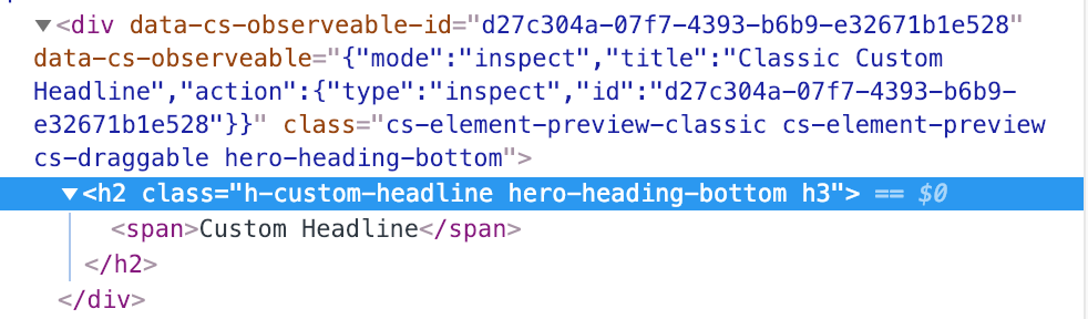
Notice there’s a wrapping div. This is only present in the live preview environment because we use this to make Classic Elements draggable. Also, notice how it’s getting the same class as the element itself. Because we have this class in two places, it multiplies the relative font sizes you’re using.

We’re going to look into how we can correct this in the builder. For now, it would be best to qualify the CSS selector a bit more. These examples will apply your styling without also being triggered on the wrapping div.

.h-custom-headline.hero-heading-bottom {
  
}

h2.hero-heading-bottom {
  
}

Hopefully this helps you get things worked out until we can fix this bug in an official release. Unfortunately it won’t be something we can fix right away because the changes involved will be something that should be during a beta testing cycle so we can avoid introducing any complications.

Okay, I seem to have solved the issue by removing the responsive text settings in the page options of each page that used them.

Is there a way to configure the responsive text settings via the global css?

Also, did I set up the css correctly for the two classes (hero-heading-top and hero-heading-bottom)?

.h-custom-headline.hero-heading-top {
    margin-top: 2%;
    font-size: 400% !important;
}

.h-custom-headline.hero-heading-bottom {
  margin-bottom: 4%;
	font-size: 200% !important;
  color: #ffffff !important;  
}

h1.hero-heading-bottom {
  margin-bottom: 4%;
	font-size: 200% !important;
  color: #ffffff !important;  
}

 
@media (max-width: 767px) {
  .h-custom-headline.hero-heading-top {
    font-size: 250% !important;
  }
  h1.hero-heading-top {
    font-size: 250% !important;
  }
   
	.h-custom-headline.hero-heading-bottom {
		font-size: 140% !important;
	 } 
   h1.hero-heading-bottom {
		font-size: 140% !important;
	 }   
}

Hello @aaron_softwarepromot,

Regretfully responsive text settings is applied on a page by page basis. There is no global settings for that. If you want, you can make use of the “Responsive Typography” feature of the theme instead which was already explain here: https://theme.co/changelog/#theme-x-5-1-0

And I can see that you are using %. Please check out this link for better understanding of how font sizes works.

Hope this helps.

Thank you for your help on this issue.

You’re welcome!
We’re glad we were able to help you out.

This topic was automatically closed 10 days after the last reply. New replies are no longer allowed.