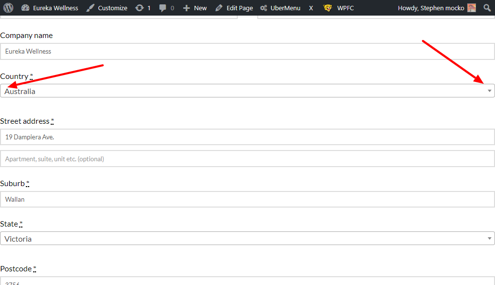
Checkout page

If you go to https://eurekawellness.com.au/checkout/, might have to add a product first, the tabs, forms and radio buttons or to the very edge of the screen as opposed to all other pages. Not sure why this is. Can it be fixed?

Also, i would like the continue shopping button on the cart page gone. Is that possible?

Thanks
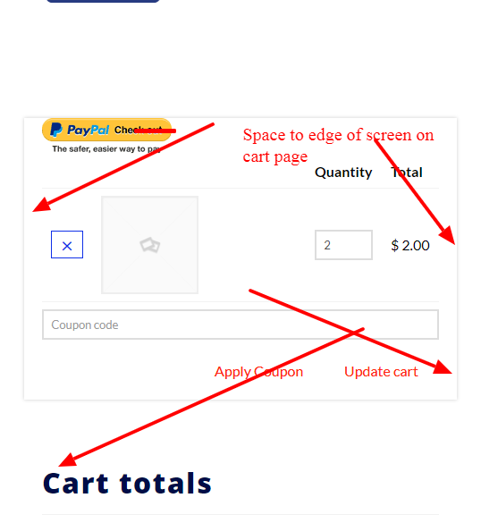
Hi,

Regretfully, at this time I am not entirely certain what it is you would like to accomplish based on the information given in your email. If you wouldn’t mind providing us with a little more clarification on what it is you’re wanting to do (a link to a similar example site would be very helpful, or perhaps some screenshots), we’ll be happy to provide you with a response once we have a better understanding of the situation.

Go to the checkout page while on a mobile device. All form fields and texts are all the way to the edge of the screen. So much so that the radio button for someone to check to accept the t&c is off the screen. I had to turn it off because people could not order.

Checkout page is to the edge on mobile.

To edge of screen on checkout page in mobile hindering acceptance of t&c radio button.

Hi there,

You use blank templates on your checkout page, and you also turned off column containers of your section rows. With that combination, you’re making a absolute full-width layout. Please inspect your section’s row and turn on the column containers :slight_smile:

It has 3 rows in total, and only the first once has column container.

And to hide the continue button, please add this CSS to your global custom CSS

    .cart_totals > div:last-child {
        display: none;
    }

Hope this helps.