Hello Staff,
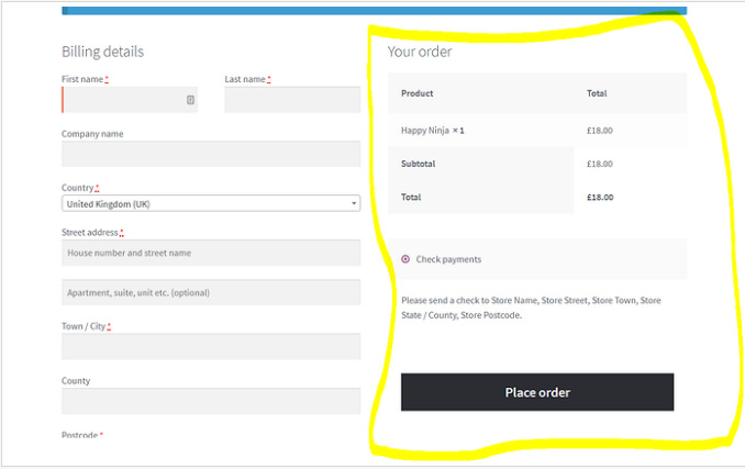
- Actually mi checkout page is in one column, but I want something the image. “Billing details” and “Your order” in two columns and responsive. It’s possible?
-
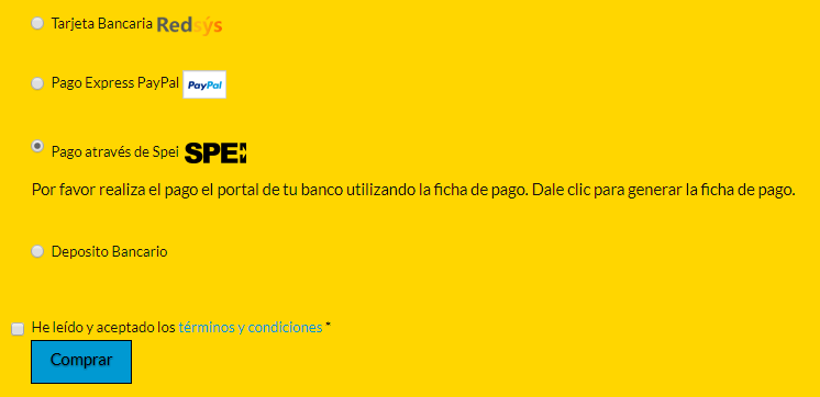
Payment options: look bad, a lot of space between them. Icons are not the same size. How can it be pleasing to the user?
-
The check “terms and conditions” is not well alienated, it is more to the left. Please, how can I fix it?
My URL is: http://midentistry.es/finalizar-compra/
Thanks