Changing columns elements for mobile

Hi, on desktop we’re using a two-column layout that follows this alternating pattern in rows:

text block <> image block
image block <> text block
text block <> image block
image block <> text block

However, when these elements stack on mobile, they look strange or broken. Is there a way on mobile to flip them all to a single pattern so the layout is more user-friendly when on smaller screens?

image block <> text block

Thanks for your help!
Hey Brian,

The current solution to this case is to first add the code below either Theme Options > CSS for global implementation or a page’s Content CSS, for per page implementation.

/**
 * Add the cs-row-flip class to a row, and the column direction will be reversed.
 */
 
.x-container.marginless-columns.cs-row-flip {
  direction: rtl;
}

.x-container.marginless-columns.cs-row-flip > .x-column  {
  direction: ltr;
}

.rtl .x-container.marginless-columns.cs-row-flip {
  direction: ltr;
}

.rtl .x-container.marginless-columns.cs-row-flip > .x-column {
  direction: rtl;
}
@media (min-width:768px) {
  .x-container.cs-row-flip > .x-column {
    float: right;
  }

  .x-container.cs-row-flip > .x-column:last-of-type {
    margin-right: 4%;
  }

  .x-container.cs-row-flip > .x-column:first-of-type {
    margin-right: 0;
  }
}

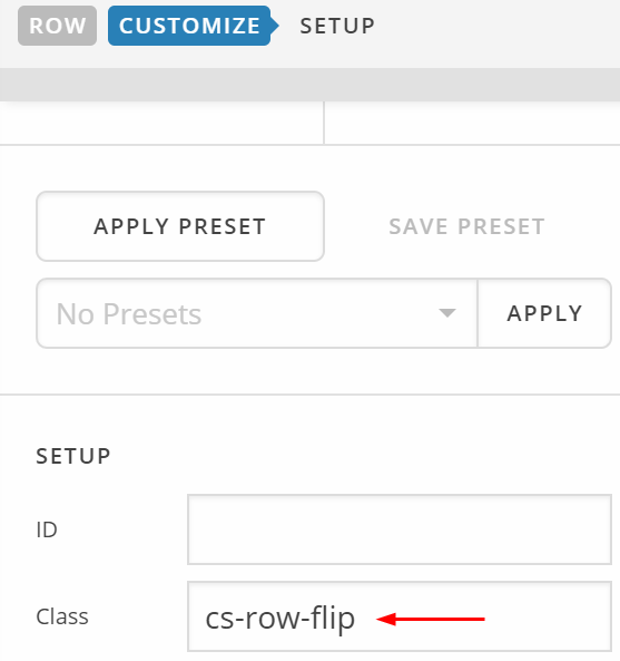
Next, add this class: cs-row-flip to alternating rows. That will flip the row’s columns so that the right column displays on top on mobile instead of the current left column.

Hope that helps.

This topic was automatically closed 10 days after the last reply. New replies are no longer allowed.