Hi, from my desktop the homepage image on my site (www.rleone.com) looks centered but is skewed on laptop, iPad, and mobile. Is there a way to center it on all devices, or else swap in a vertical pic when shown on these other devices. Thank you!
using X Theme/Renew v6.5.6
Hi @rleon72,
It is caused by the negative margins that you have set to the section that contains the image:
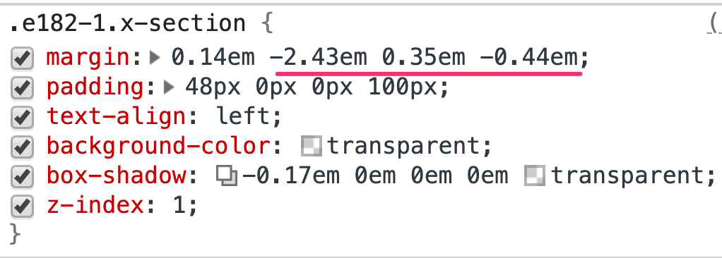
Please get rid and avoid using negative margins as it will cause layout issues.
Hope this helps.
Thank you. My image is now centered on Desktop and Laptop but unfortunately my image is now smaller than I would like and doesn’t appear on iPad or mobile.
Is the best solution to just swap out an image for iPad and mobile devices, and if so, how do I do that?
Hey @rleon72,
I checked your homepage image and you’re hiding the image for mid and smaller screens. Please inspect your image element in Cornerstone then go to the Customize tab (see screenshot)
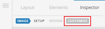
Deselect the Hide During Breakpoints options:

You’re seeing the image smaller in small devices because of the responsive behavior of the image. If you’d like to swap the image for small devices then you can use the Hide During Breakpoints feature, simply hide the current image for small devices as you’re doing now and add another one for small devices and display it only in smaller screens and hide it for large screens.
Hope this helps!
1 Like
Excellent! Thank you.
Glad that we could be of help 
This topic was automatically closed 10 days after the last reply. New replies are no longer allowed.