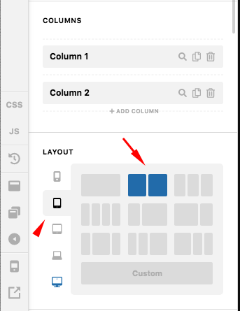
Can you change the mobile view while keeping the desktop view?

Hi,

This is my first time making a website and using the X theme and cornerstone. My desktop view is as how I want it and how I designed it in my wireframes. When I just switched to mobile view the layout changes and some features don’t work. Is there any way I can keep my desktop view but change my mobile view?

Thanks!
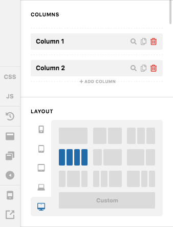
Hello Isla,

Thanks for writing in!

The columns of the rows and section will collapse when you are in a smaller screens. For example, if you have two or three columns in desktop view, when you are in a smaller screen, the columns collapse and will now have 1 column stacked below each other. You cannot have two columns in smaller screen.

And if you are using the new Row element, you can always change that setting. You can accurately set up how may columns you want to display in different screen view. Please use the new Row element and set your columns as shown below:

Hope this makes sense.

This topic was automatically closed 10 days after the last reply. New replies are no longer allowed.