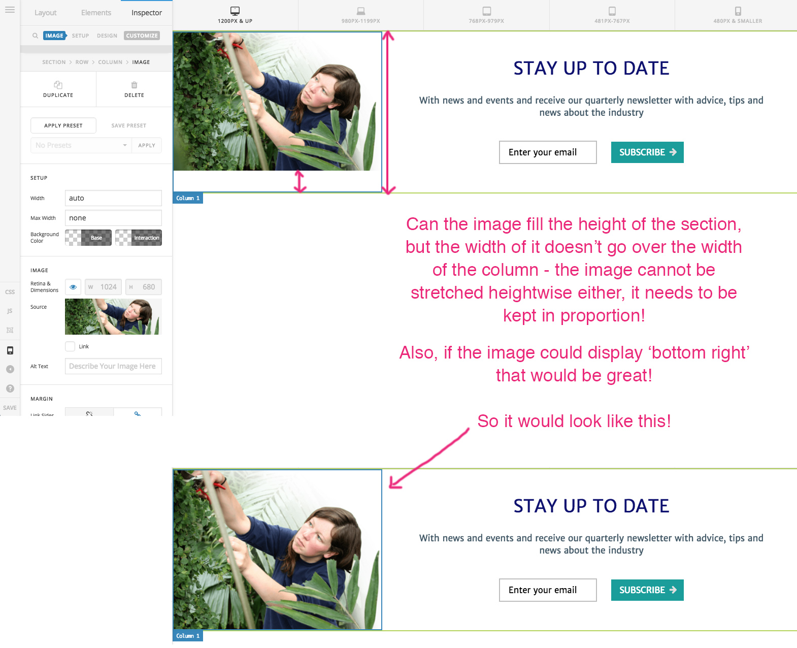
Can the image fill the height of the section without going over the width of the column?

Hi, I’m working on a site and I’ve split a section into 2 columns, with an image on the left and text to the right. The thing is, when viewed on some screens, the image doesn’t fill the height of the section. Is it possible for the image to fill the height but not go over the width of the column, and to keep it’s proportions so the image isn’t just stretched height wise to fill the gap?

I’ve attached a pic for you to see - please excuse the badly drawn arrows, I was rushing!

I’ll put the URL in a secure note as it’s on a temporary link.

Thanks!
hi there,

Thanks for writing in!

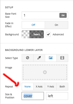
Please add the image as the background to the left column and size 100%.

Use Gap element to keep the height in mobile device.

Hope this helps!

Thanks

Hi, that’s great, thanks! However it would be useful to have more control over image size and what part of the image shows etc, as there’s been many occasions where the design has been compromised as I can’t achieve what I want due to the restrictions on the image element.

Thanks for your help!

You are most welcome!
Happy to help anytime!

Thanks

This topic was automatically closed 10 days after the last reply. New replies are no longer allowed.