Hello,
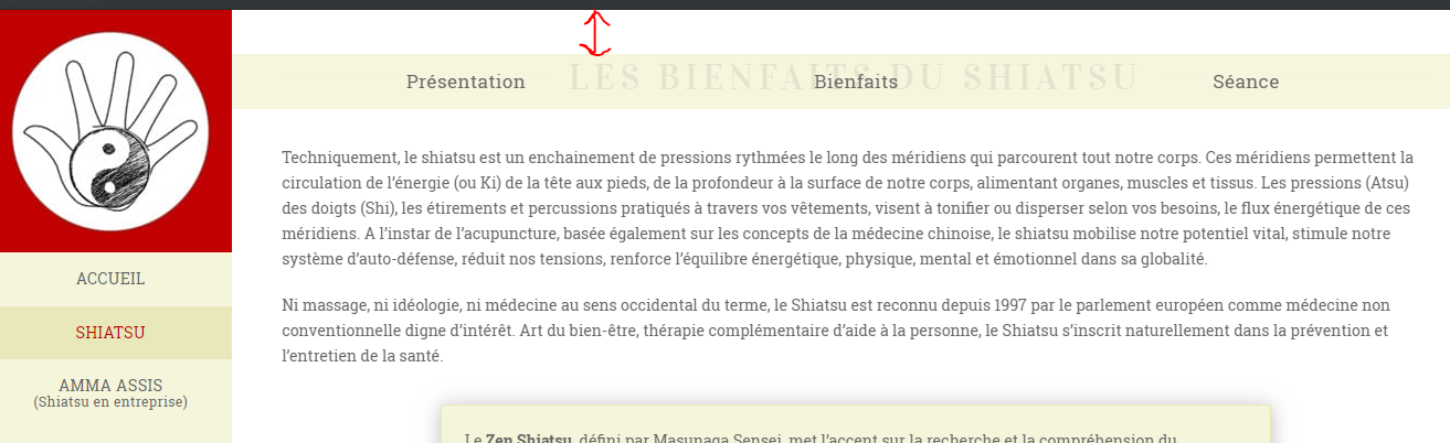
Can a row act as a fixed-top menu?
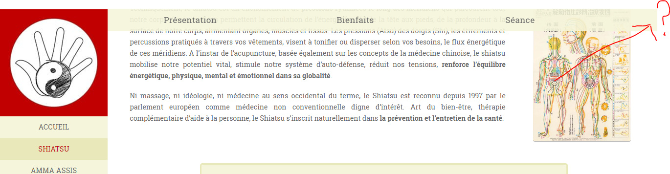
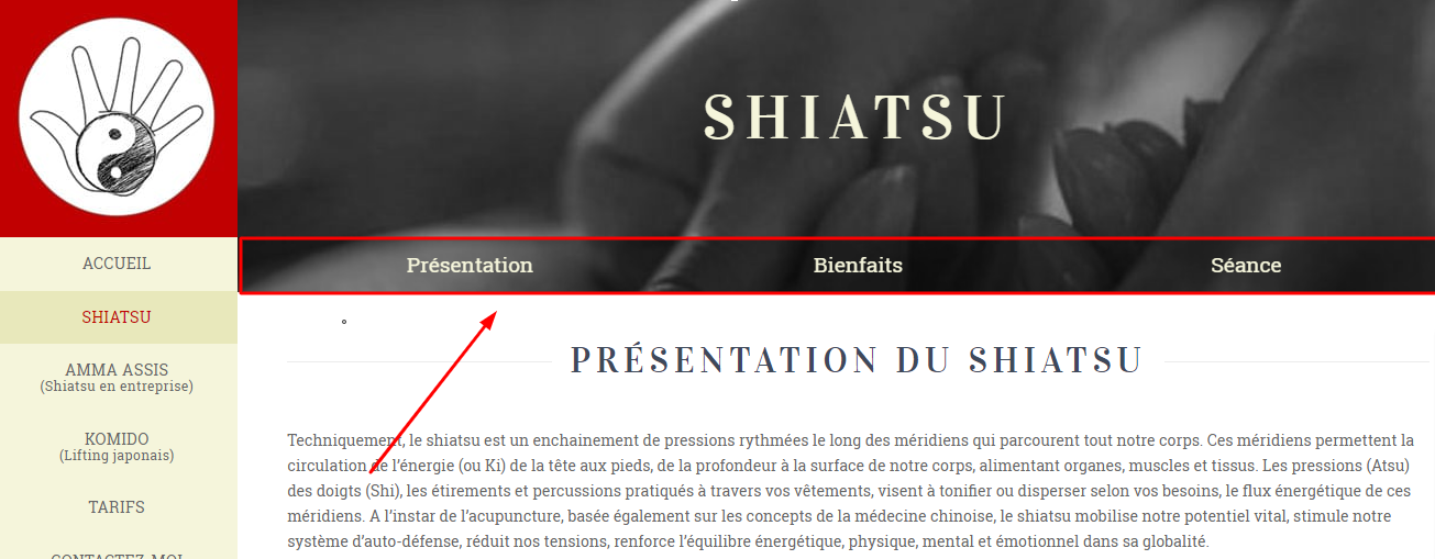
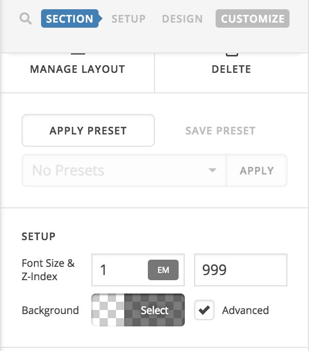
I use a Fixed Left menu on my website. On one page, I added a menu redirected to the sections of the page. Then the user scroll down, I’d like the row (=menu) to stay as the top on the page, as a fixed-top menu would do. Is there a class I could assign to this row - or something similar - in order to make it work?
URL: https://unepausenergetique.fr/shiatsu-harmonie-corps-esprit/ (pwd: france)
Thanks,
Antoine
 )
)