Hi,
On this site - http://www.redstarsvenray.nl - we have made categories consisting of an image + button. On desktop it looks great because the button has been given a set width.
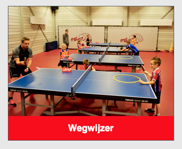
However, when the screen gets smaller the button remains that width and doesn’t shrink with the image.
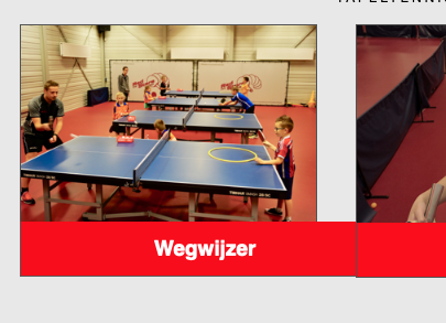
How can I get these buttons to be responsive so they shrink with the column they’re in?

