Good afternoon,
in my Pro header I have a breadcrumb which looks great on everything until we get to mobile. I am finding that is the product name is quite long it cuts off.
Please advise
Jason
Good afternoon,
in my Pro header I have a breadcrumb which looks great on everything until we get to mobile. I am finding that is the product name is quite long it cuts off.
Please advise
Jason
Hi @hyperdrive_boom,
Thanks for writing to us.
Please add this code in theme option’s CSS to make the breadcrumb visible.
   @media(max-width:767px){
      a.x-crumbs-link.x-crumbs-current {
       white-space: break-spaces;
     }
   }
Feel free to change the margin value.
The purpose of providing the custom CSS to show you how to add CSS code to your site. Writing custom CSS is outside the scope of our theme support. If you need more customization, you need to learn CSS and learn how to use the browser’s element inspector.
Hope it helps you.
Thanks
Hi @hyperdrive_boom,
By withdrawing the post, I believe you already have resolved the issue. If the issue still exists, you can let us know.
Thanks.
Good afternoon,
I have inserted the code into the theme option’s CSS and nothing has changed.
Please advise
Thank you,
Jason
Hi @hyperdrive_boom,
I checked this page https://kpopsupplyco.com/product/bbts-j-hope-vintage-tee-copy-copy-copy-copy/ on mobile and the breadcrumb is already fix by the CSS provided by my colleague.
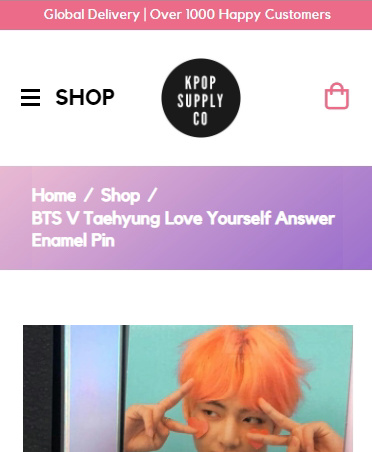
If you didn’t see the changes, please clear your browser cache.
Hope that helps.
Thank you.
Hello @hyperdrive_boom
I tested your site in iPhone Chrome and Safari browser it is working fine at my end.
Safari
Chrome
I would suggest you check in the private mode of the browser.
Thanks
This topic was automatically closed 10 days after the last reply. New replies are no longer allowed.


