Hello,
I’ve made parameters to capture the border settings for a component, but I can’t see how to map a toggle to the actual border toggle to switch border on and off.
I see it mentioned for 6.7 but it doesn’t seem to have happened.
Bill.
Hello,
I’ve made parameters to capture the border settings for a component, but I can’t see how to map a toggle to the actual border toggle to switch border on and off.
I see it mentioned for 6.7 but it doesn’t seem to have happened.
Bill.
Hello Bill,
Thanks for writing in! When the Border toggle is disabled, the value of the Border Width is !0px. When it is active, the value is 0px. The only difference is the ! exclamation character. You may need to pass this to your border width parameter, for example:
{
  "border" : {
    "type"    : "toggle",
    "label"   : "Border",
    "initial" : false
  },
  "borderWidth" : {
    "label"       : "Border Width",
    "type"        : "border-width",
    "initial"     : "!0px",
    "when"    	  : "not(eq(border, false))"
  }
}
Hope this makes sense.
Sort of.
If I set this up, make an instance of the component and set width to 1px, clicking the toggle doesn’t make the border disappear, just the controls on the element are hidden.
I want to click the toggle and see the border disappear.
e.g.
Before:
After
I want the same approach as the native border controls - if I switch off border, it really disappears.
Is this possible?
Thanks, Bill.
Hello Bill,
Please update your parameter with this code and then check it again.
{
  "border": {
    "type": "toggle",
    "label": "Border",
    "initial": false
  },
  "borderWidth": {
    "label": "Border Width",
    "type": "border-width",
    "initial": "1px",
    "condition": {
      "key": "border",
      "op": "===",
      "value": true
    }
  }
}
Hope it helps
Thanks
How is this supposed to solve my question? The condition block isn’t documented in the Docs for parameters, what does it do? I want the border to disappear when the toggle is false, and not allow the 1px I’ve entered to have any effect.
Here’s my complete parameters - can you make it work like a regular Border panel?
Thanks, Bill.
“border”: {
“type”: “toggle”,
“label”: “Border”,
“initial”: false
},
“borderColor”: {
“type”: “color”,
“label”: “Color”,
“initial”: “transparent”,
“when”: “not(eq(border, false))”
},
“borderStyle”: {
“type”: “select”,
“label”: “Style”,
“options”: [
{ “value”: “none”, “label”: “None” },
{ “value”: “solid”, “label”: “Solid” },
{ “value”: “dashed”, “label”: “Dashed” },
{ “value”: “dotted”, “label”: “Dotted” },
{ “value”: “double”, “label”: “Double” },
{ “value”: “groove”, “label”: “Groove” },
{ “value”: “ridge”, “label”: “Ridge” },
{ “value”: “inset”, “label”: “Inset” },
{ “value”: “outset”, “label”: “Outset” }
],
“initial”: “none”,
“when”: “not(eq(border, false))”
},
“borderWidth”: {
“label”: “Width”,
“type”: “border-width”,
“initial”: “!0px”,
“when”: “not(eq(border, false))”,
“isVar”: true,
“condition”: {
“key”: “border”,
“op”: “===”,
“value”: true
},
“borderRadius”: {
“label”: “Radius”,
“type”: “dimension”,
“initial”: “!0px”,
“when”: “not(eq(border, false))”,
“isVar”: true
},
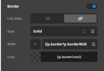
I’m not sure how you would do this without Twig, but here is what worked with me in the Border Width control. Have a great weekend.
{{p.border?p.borderWidth:"0px"}}
This topic was automatically closed 10 days after the last reply. New replies are no longer allowed.

