Blog text displaying weirdly on mobile phone

Hi there,

I have read another support discussion on this forum about this but it doesn’t seem to solve my issue.

On my phone, I can read blog posts from my website with no issue. However, when I try to read blog pages on my phone, the text and images are really narrow in the centre of the screen. I’ve tried changing my margins to 0px but this just makes the page content look weird when I view it on a computer screen.

Any thoughts?

Thanks!
Hello @vancouverwithlove,

Thanks for writing in!

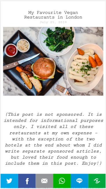
Can you please let us know the Phone and browser that you are using as on my end I am unable to replicate the issue? Please see screenshot.

Thanks.

Thanks for the reply! I’m using an iPhone XR and Safari.

I did notice that the image you posted above is of one of my posts, not pages. The posts show up fine on phone screens, it’s just the pages I have issues with!

Thanks,

Hello @vancouverwithlove,

I have inspected your site and I am seeing a JS error. Please have your custom JS code updated and use this instead:

(function($){ 
  $('.x-recent-posts a').attr('title', '');
  $('.entry-thumb a').attr('title', '');
  $('.entry-featured a').attr('title', '');
  $('.entry-thumb').attr('title', '');
  $('.attachment-entry-fullwidth').attr('title', '');
})(jQuery);

I have simplified it and made it shorter and valid.

Please let us know how it goes.

Thank you! We sorted it. :slight_smile:

You are most welcome!

This topic was automatically closed 10 days after the last reply. New replies are no longer allowed.