Hey ThemeX folks,
Desired Outcome
I would like to achieve a similar structure with my blog setup as shown here.

In essence,
- main container is centred with a max-width of 62.5 rem (red line)
- text container is further limited by a 75% width so it creates the additional space (blue line)
- sub-headings in blue have a negative margin so it stands out from the text container
Then there are breaker sections in new containers that utilise full width.
-
I am wondering what the optimal utilisation of sections, rows and columns is to create a similar design? What should be set on each level (section, row, column, element)?
-
It’s cumbersome to utilise inline CSS for each section and apply a max-width. I tried adding a custom CSS class to sections or rows but these values are overwritten. I assume it’s just a CSS selector problem to include children?
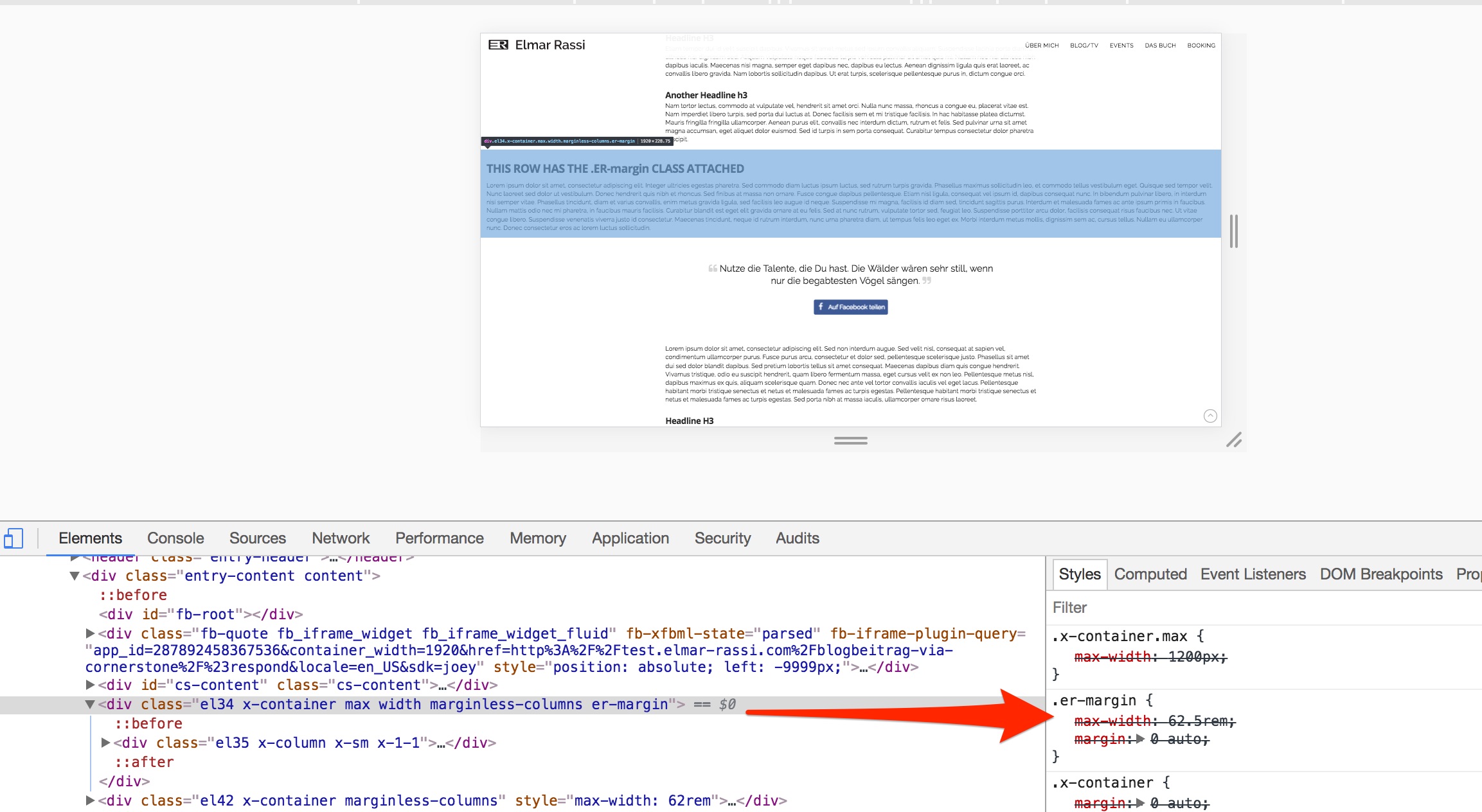
-
I am building this to create a gallery of building blocks so content creators can use these elements later on. So I am aiming for a slim setup where most of the stuff is handled via CSS classes.
-
I am also struggling to wrap my head around the margin/padding issue going from desktop to mobile. I would like to limit excessive media queries to restate paddings and margins on different devices. Because I think there is a more elegant solution to this? For example, setting the max-width in rem instead of % works well on desktop and mobile without additional media queries.
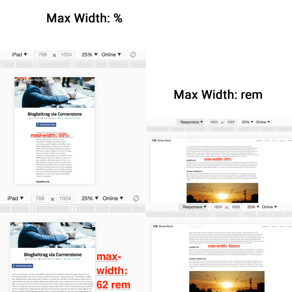
What I changed so far
- set the entry-wrap to padding: 0 -> otherwise I thought I cannot have full-width sections in between
- set the site layout in the theme settings to full-width with a max width of 1920px and the site width to 100%.
Hope you can assist me? 

Best
Adrian