Block Grid on Mobile

Hi there,

I would like my section on the website http://cds.monicaangelreynolds.com (which is where the icons are) below the video, to be mobile responsive. On Mobile it looks pretty bad- as attached here. It looks like one icon per row. Is there a way to make all for columns appear on one line on mobile? Since there are 8 total, it would be ideal if there were four above (in the block grid) and four below (in block grid).

Thanks so much!
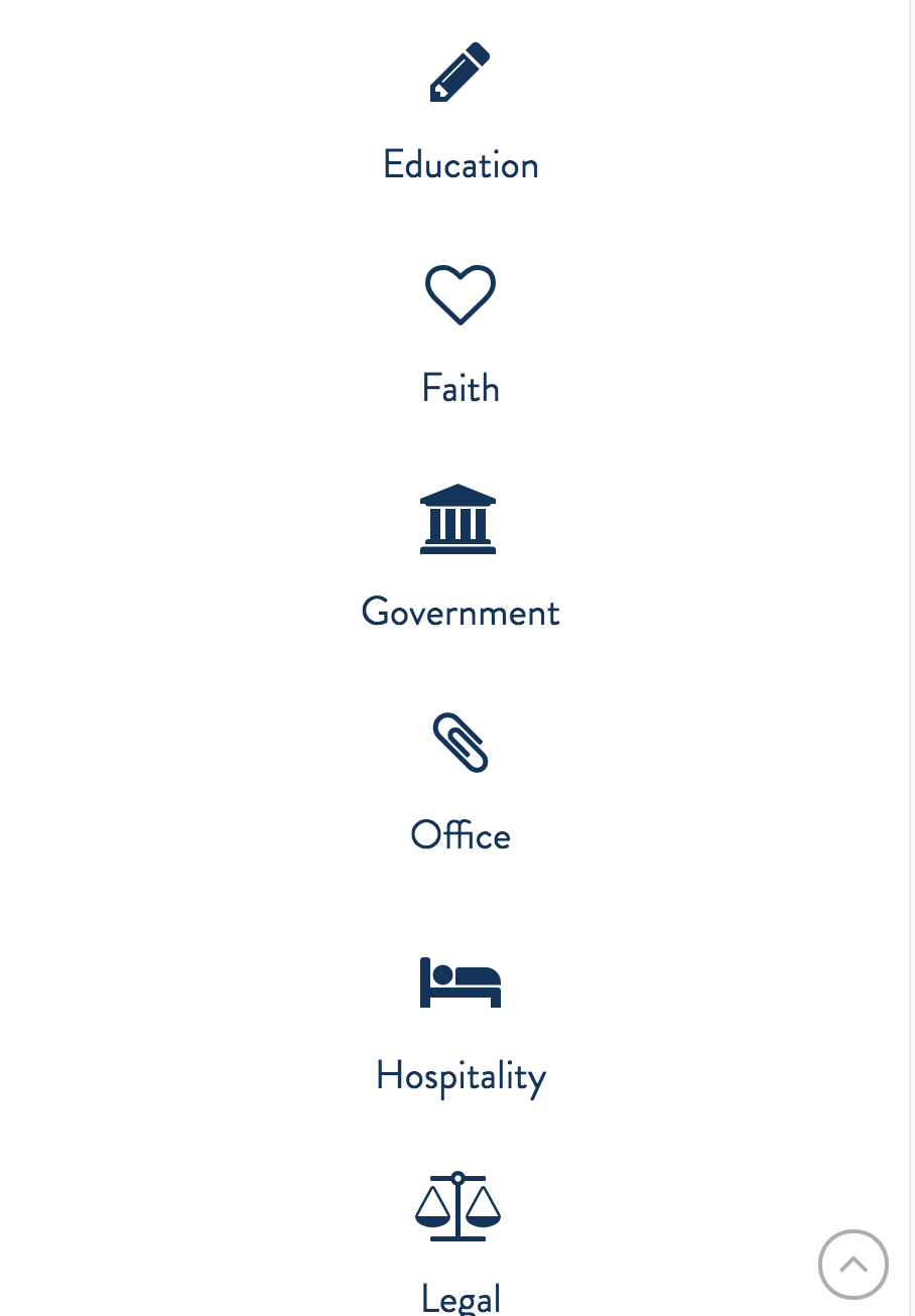
Hello There,

Thanks for writing in! Because of the limited width in smaller screen, the 8 icons, can not be accommodated. I would suggest that you display 2 icons for each row.

To do that, please edit your page back in Cornerstone and insert the following custom css in the settings tab, Settings > Custom CSS

@media (max-width: 480px){
  .x-block-grid.four-up>li {
    width: 47.5%;
    margin-top: 0 !Important;
  }

  .x-block-grid.four-up>li:nth-child(2n) {
    margin-right: 0;
  }

  .x-block-grid.four-up>li:nth-child(2n+1) {
    clear: both;
  }
}

We would loved to know if this has work for you. Thank you.