Best way to insert a responsive image in sidebar?

Hi,

I’d like to insert an image in the sidebar and make it span the entire width no matter what screen size. What is the best way to do this? Create a global block?

[Edit] I’ve gone ahead and added a global block button. How do I make it stretch 100% width across the sidebar? It’s the youtube button here:

https://followtheboat.com/join-ftbmates-our-private-members-club/
Hi @demonboy,

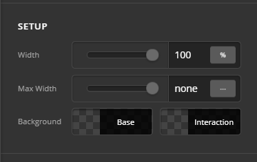
Thank you for reaching out to us. I checked your setup and I see you’re using an image in the Button element, I’d recommend you to use an Image element instead. To make it span fullwidth, set the Width to 100% (see screenshot)

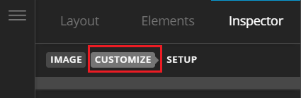
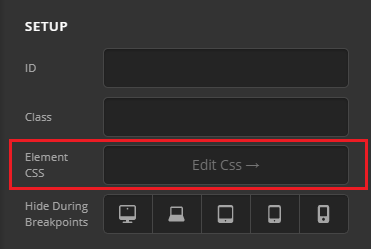
Then go to Customize tab > Element CSS and paste the following code:

$el img {
  width: 100%
}

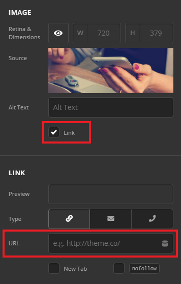
Now to add a link to your Image, simply enable the Link option and enter the link in the URL field (see screenshot)

Let us know how this goes!

Hi @Nabeel, appreciate the feedback. Does this allow any roll-over effect?

Hey @demonboy,

Currently the Image element doesn’t have any roll-over effect, however you can do this with custom CSS, try replacing the previous code with the following code in the Element CSS field:

$el img { width: 100%; transition: all .2s ease-in-out; }
$el img:hover { transform: scale(0.9); }

Hope this helps!

This topic was automatically closed 10 days after the last reply. New replies are no longer allowed.