Banner position

Hi there,

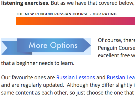
On this page https://thelanguagesherpa.com/russian-guide/ you can see that in a number of places I have a blue banner in the text that says ‘more options’. It is an image that I have embedded into the text.

Would you please tell me how I can reduce the white space above and below this banner? I don’t understand where this large padding has come from…

Also, do you know how I can make the banner jut out into the margin on the left slightly?

Thank you!
LS

Hello There,

Thanks for writing in! I have checked the page and your image. It seems that in the image itself, there are so much empty white spaces.

I would highly recommend that you edit your image in an image editor like photoshop and at least reduced the height and remove the extra white spaces.

Please let us know how it goes.

Hi Rue,

I followed your advice and it looks much better now, so thank you.

But would you now please be able to tell me how I can make the banner jut out to the left into the white margin?

Thank you,
LS

Hi There,

Upon checking, I see that your referenced banner is now properly aligned.

Make sure to clear your browser cache before testing.

Thanks!

Hi Darshana,

I actually want it to jut out to the left into the margin, with the text staying where it is.

LS

Hi there,

Do you mean you want to push the more options image further to the left?

If so, please add a class to the image then add this code to the Global CSS:

@media (min-width: 768px) {
    .pull-left {
        margin-left: -85px;
    }
}

The code above assumes that the class you have added to the image is pull-left.

Please change the value of the left margin in the code if you need to.


You can find more info on how to check for CSS selectors here.
Then information about writing your custom CSS here.

Hope this helps.

Thank you, Jade, it worked perfectly

LS

Glad we were able to help :slight_smile:

This topic was automatically closed 10 days after the last reply. New replies are no longer allowed.