Bad responsiveness for iPad resolution

Hello I have a webpage that displays fine in a desktop resolution and also pretty good in a smartphone resolution. But viewing on a tablet looks horrible.

Here is a screen cap

How can I improve this? Why does the column go there and buttons shift to the left and not centered?

Hi @juryk,

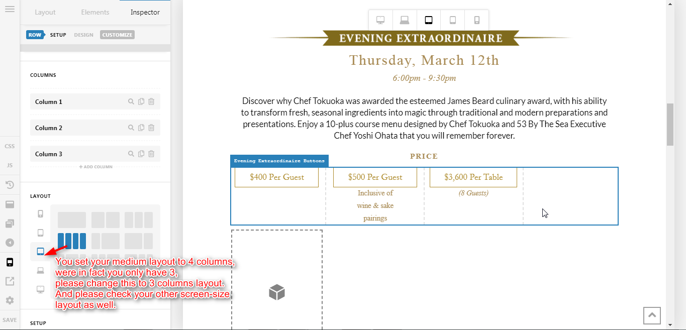
Thank you for writing in, please preview your page in Medium screen size


And adjust your Layout Accordingly, see the note on the following screenshot.


Hope it helps,
Cheers!

Wow learned something new today that was easy to fix!

I have a new problem now, on some sections i used 4 column layouts with two outside columns simply for spacing purposes. now that i have removed these empty columns there is way too much space between buttons:

how can i keep these buttons closer together on a desktop view without ruining the smaller resolution displays?

In fact how can i keep that paragraph above it to display closer to the rest of the elements, like this:

Hi @juryk,

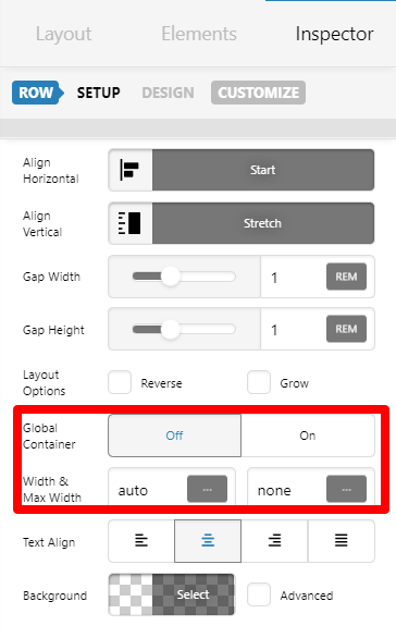
Inspect the ROW with the button. Turn off GLOBAL CONTAINER and then set Max-width instead for the ROW that will make the button side by side with preferred spacing.

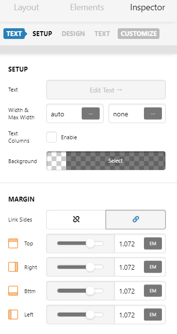
Inspect the text element. Decrease top and bottom margin:

Hope this helps.

This topic was automatically closed 10 days after the last reply. New replies are no longer allowed.