If you were to look at my home page on mobile, My background image shrinks where you cant see what it is. I have it orientated to the left so the words on don’t obscure it but is there a way to make the image look better on mobile?
Hello @ashfillmore1,
Thanks for writing in!
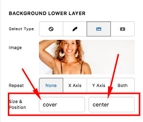
The background image is doing exactly what you have set it. You have made it cover the whole section and align to the center.
I would like you to try this demo here: https://davidwalsh.name/demo/background-size.html which would explain how background image works.
We use the background-image: cover; which would cover the whole area of the container. This is responsive enough which will always covers the whole area. The only thing to consider here is that if your image size is smaller, it will be stretch out and if you have a bigger image, it will get cut off.
Yes we can use background-size: 100% 100%; which is also responsive but your image will either be stretch out or get squeezed depending on the size of the container.
Yes we can also use background-size: 100% auto; but then as soon as you resize your browser or on smaller screen sizes, you will probably have white spaces around the image.
Or we can also use background-size: contain; but then this is not a good choice because you will see white spaces around your image.
Best Regards.
This topic was automatically closed 10 days after the last reply. New replies are no longer allowed.