Background image fixed

Hi,

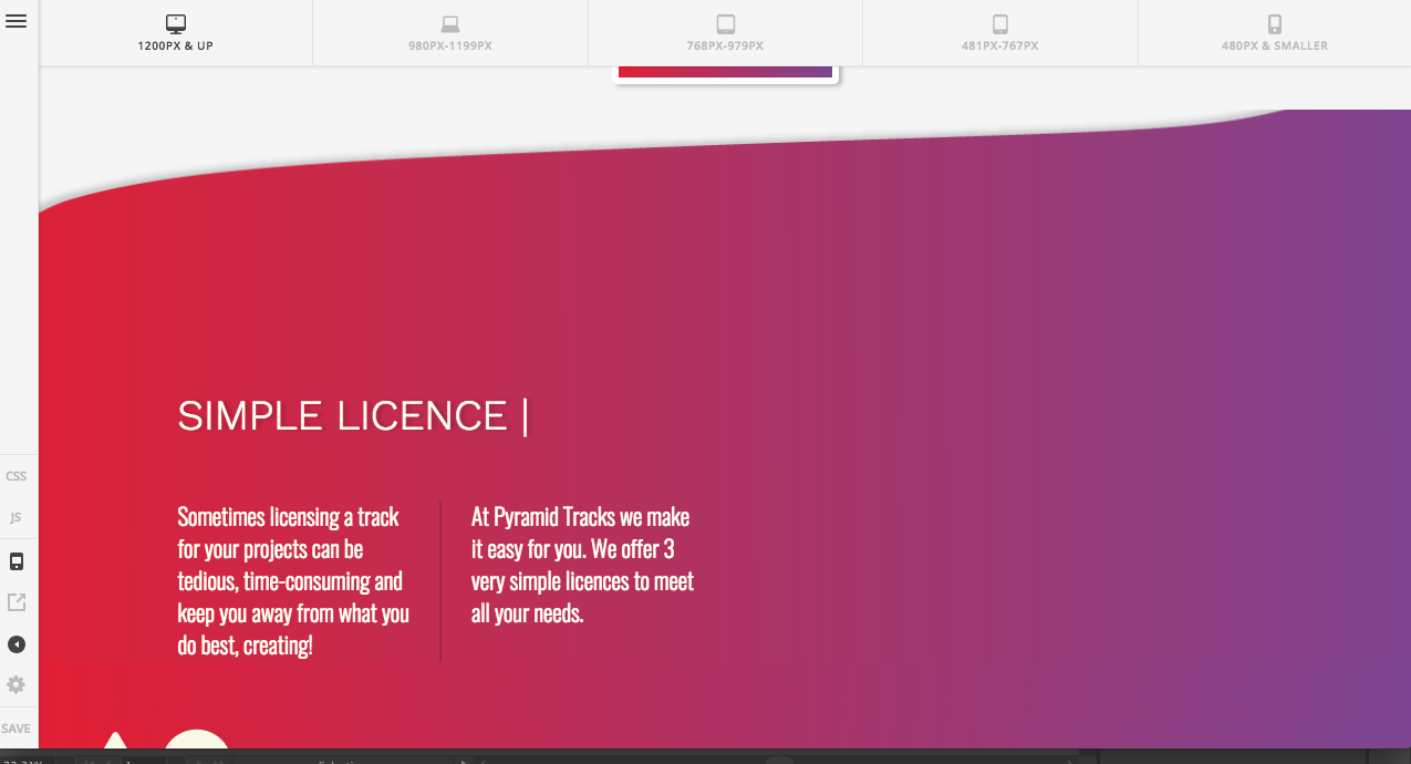
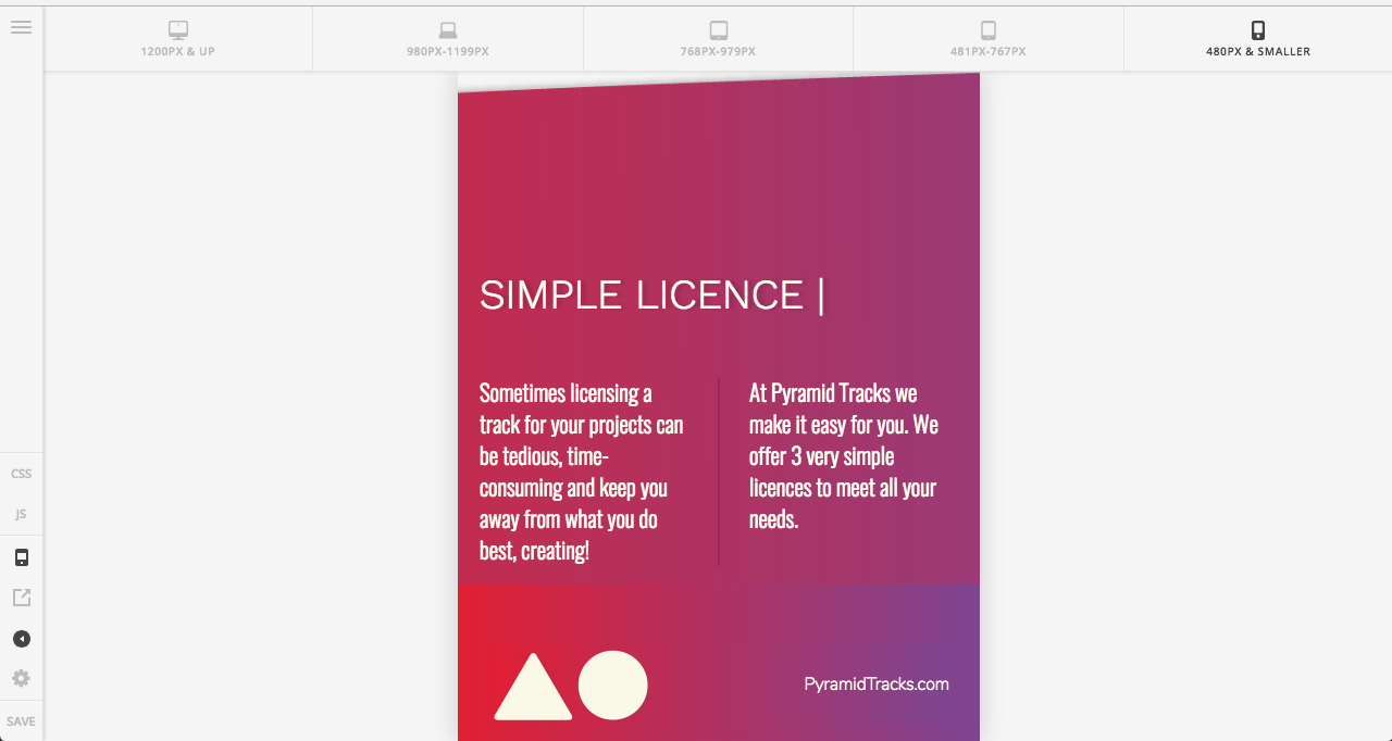
I have added some gradient background images and I would like them to stay the same way and responsive using mobile etc.

Summary

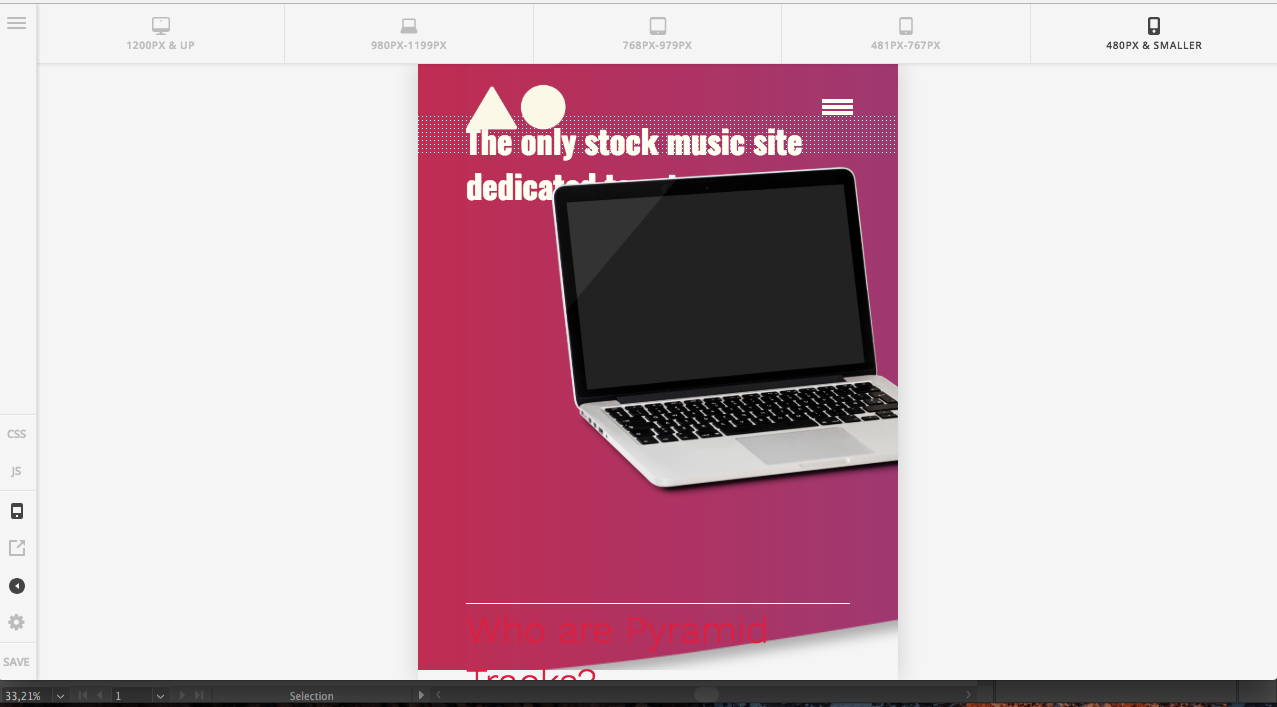
You can see in the images they look pretty bad in mobile version. and the gradients dont match up with the fixed foot gradient.

How can I make the images be responsive and keep the gradients?
Hi There,

Please add the my-section class to your section.

After that adding this custom CSS under Theme Options > CSS:

@media (max-width: 767px){
    .x-section.my-section .x-bg .x-bg-layer-upper-image {
        width: 100% !important;
    }
}

Hope it helps :slight_smile:

This topic was automatically closed 10 days after the last reply. New replies are no longer allowed.