Hi there, how would I apply a padding-top: 150px to a desktop screen, but then have the same element have 50px on a mobile screen?
Thanks.
Hi there, how would I apply a padding-top: 150px to a desktop screen, but then have the same element have 50px on a mobile screen?
Thanks.
Hi @logoglo,
We can use custom CSS to achieve it. We will reset the desktop paddding using Custom CSS. CSS selector depends on the element. For example, we will do it on a section:
@media(max-width:480px){
  $el.x-section{
    padding:0;
  }
}
Look at this: https://screencast-o-matic.com/watch/cYVrQfvsrO
To inspect classes added on the element, the following will help:
Thansk, so I added a class to the content band I needed with less padding on a mobile, and added your css, but it didnt seam to do anything?
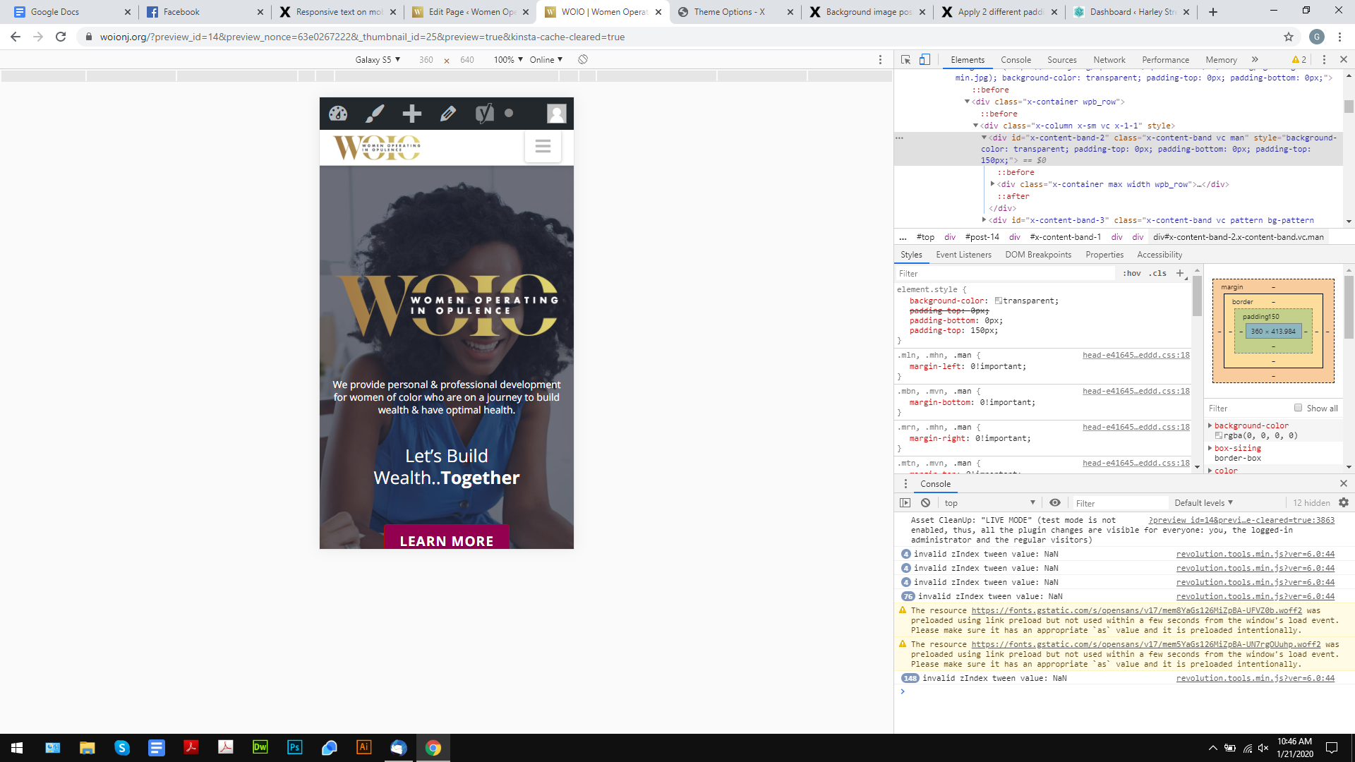
the website in question is https://woionj.org/
Thanks for your help
Hi @logoglo,
You are using an older implementation of the sections on your page and the suggestions by Lely are now the new sections.
You mentioned you have added a class to the content band, however, I do not see any custom class added to it:
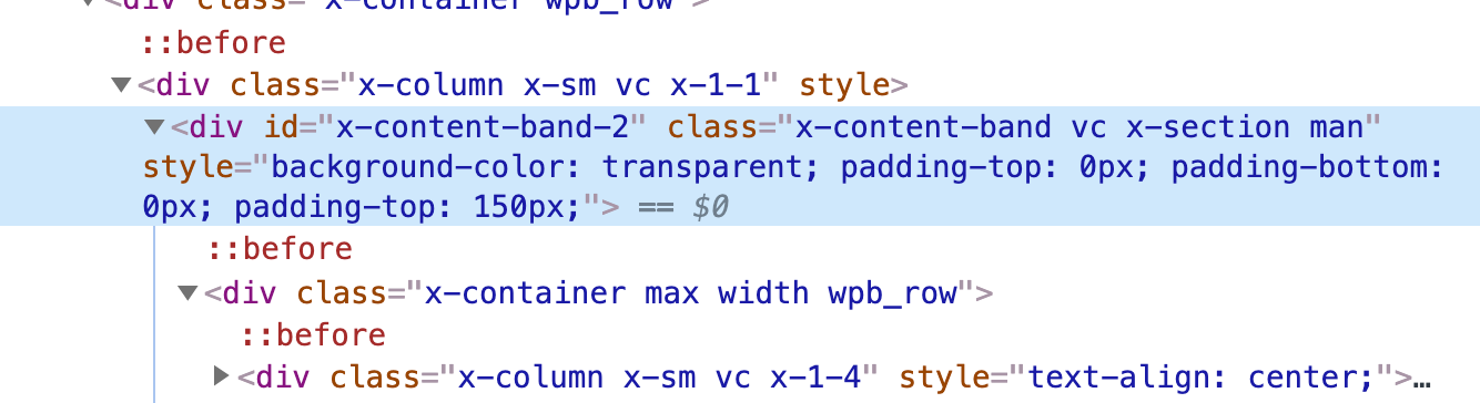
Try targeting the content back through its ID instead like this:
@media( min-width: 481px ) {
    #x-content-band-1 #x-content-band-2 {
        padding-top: 150px !important;
    }
}

@media( max-width: 480px ) {
    #x-content-band-1 #x-content-band-2 {
        padding-top: 50px !important;
    }
}
If you’re able actually add custom CSS to the content bands you want to target, then you can update to code to something like this:
@media( min-width: 481px ) {
    .the-custom-class {
        padding-top: 150px !important;
    }
}

@media( max-width: 480px ) {
    .the-custom-class {
        padding-top: 50px !important;
    }
}
Hope this helps.
That 2nd option worked perfectly! thank you!
This topic was automatically closed 10 days after the last reply. New replies are no longer allowed.