Animated Cards in columns don't have the same responsiveness but they have same settings

Hi,

I am going a little bit bad trying to find out why the animated cards in my last column of the programme section on my home page, don’t become 2 columns when the screen is smaller that 776px and bigger than 481px.

The responsiveness settings are exactly the same but they are not behaving the same.

http://www.bristolphotofestival.org/wordpress

Any tips? Thanks
Hi Alejandro,

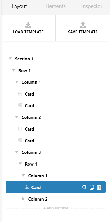
You have 3 columns. Each with 2 cards in it. On less than 776px screen, the first 2 columns is side by side. Since the other is orphan, it became 1 column.

See this: http://somup.com/cYhlhwjb0b
I have added the border to clearly see the columns.

To fixed it, on that orphan 3rd column, please add another ROW element in it. Inside this ROW element, add the 2 cards element. Then on the reponsive column layout settings on this ROW element, set it have 2 columns under 776px.

Hope this helps.

Thanks. I have tried this but I had no luck fixing the issue. It seems the columns behave correctly if click 3 columns on the responsive panel but not if i click 2 columns. Any other thoughts?

Hi Alejandro,

Here is the main Layout:

Look on this screencast for the ROW LAYOUT Settings both of them and how it looks on frontend responsively.

http://somup.com/cYhllxjFig

Hi Lely,

thanks for your help. I have fixed it now.

We are happy to help,

Cheers

This topic was automatically closed 10 days after the last reply. New replies are no longer allowed.