Hi Guys,
Quick question, on the site I’m building www.ostoform.com, the menu is working on desktop, but not linking to the anchor links on mobile? Might be something simple, but would you have any ideas yourself?
Thanks a million
Hi Guys,
Quick question, on the site I’m building www.ostoform.com, the menu is working on desktop, but not linking to the anchor links on mobile? Might be something simple, but would you have any ideas yourself?
Thanks a million
Hi Billy,
I have checked your site and it seems that you have different sections to be displayed on desktop and mobile devices.
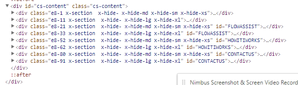
Please note that as a rule, IDs must be unique in a document which means you should only assign an ID once in every page and not reuse it to other sections or element.
Kindly change the IDs of the sections that will be displayed on mobile. For example, the mobile section for FLOWASSIST, try changing it to FLOWASSIST-MOBILE.
Then go to Appearance > Menus then add menu the new menu items that will link to the sections on mobile.
For example. another menu item with menu label FLOWASSIST that links to FLOWASSIST-MOBILE and so on for the other section.
When you do that, you will have 6 menu items that will display on the site. To correctly set which menu items to display for desktop on mobile, you can add some ready classes to the menu items’ CSS Classes field:
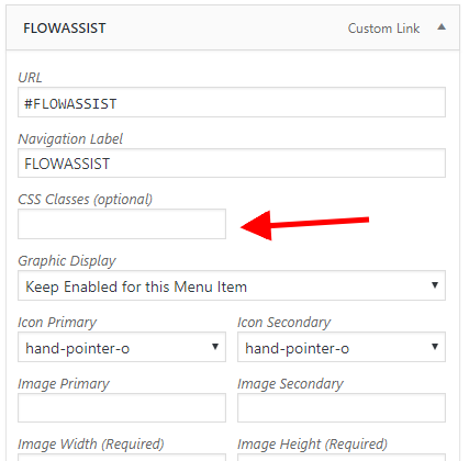
Please add the classes x-hide-md x-hide-sm x-hide-xs to the menu items that will be displayed on mobile and the classes x-hide-lg x-hide-xl to the menu items that will be displayed on desktop.
As an example, I have done this for the first section.
Hope this helps.
Thank you Jade, yet another really detailed, helpful and well explained answer to my query. And I seem to have a lot of them these days! Thank you sincerely for looking into this and taking the first steps in implementing the solution, I’ll give it a go with the rest.
You are most welcome. We are delighted to hear that. 
This topic was automatically closed 10 days after the last reply. New replies are no longer allowed.