Hey Patrizia,
Before I provide the override code to achieve what you need, I’d first like to show you why that is happening.
Please take a look at box 1 in the screenshot below.
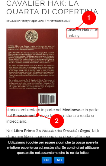
It’s the same size as box 2 but look at the words “storico ambientato”. It does not fix box 2. Because the combination of those words doesn’t fit the container, they are pushed below the image. That is just a spatial limitation.
The solution to that is to reduce the image size on mobile view. Please add this code in X > Theme Options > CSS.
@media (max-width:480px) {
   .alignleft,
    .alignright {
        max-width: 30%;
    }
}
This would be the result:
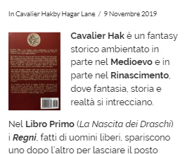
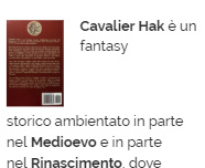
Please just note that it would still break on really old phones or small screen phones. In this case, you will want to follow Ruenel’s suggestion. Just reduce the media query breakpoint.
Hope that helps.


