Hello,
this should be an easy fix, but I have been trying to solve alignment issues for a header and button for ages and not making any progress.
I am using the Classic Custom Headline (ID added for Anchor) & the new Button elements in 1 row and 1 column.
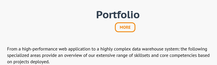
Both elements need be displayed side by side, as marked in red:

However, in the Cornerstone preview and online the button is displayed underneath the Headline.
http://managetopia.apps-1and1.net/
I tried splitting the row into 2 columns, but the display on a small screen (desktop: < 767px) looks worse - Headline right, button left - see link listed above, section with Headline “Business Cases”!
I know a container would solve the problem, but I need to use the new button element because of the customization used on that page.
Do you have a CSS fix for the nowrap/break problem?
Many thanks for your help


 Feel free to ask if you face any further issues.