Hi,
My second row (last section) is not centering properly on mobile, but looks ok on desktop.
Also, the last column on that same row is not vertically aligned with the other 2 columns, but appears lower down.
Can you please help?
Hi,
My second row (last section) is not centering properly on mobile, but looks ok on desktop.
Also, the last column on that same row is not vertically aligned with the other 2 columns, but appears lower down.
Can you please help?
Hi there,
Please click on the customize option of the two columns at the top of the page you have link then add the class half to both columns.

Then edit this code:
div#we-talk .x-column.x-1-3 {
    margin: 0;
    text-align: center;
    width: 33.3333%;
}
to
@media (min-width: 768px) {
    div#we-talk .x-column.x-1-3 {
        margin: 0;
        text-align: center;
        width: 33.3333%;
    }
}
Hope this helps.
Hi, which two columns from that row should I add the class to as there are 3 in that row? Thank you
I’ve only replaced the old code with the new one and the overall alignment of the row is solved massive thanks!! What about the last column from that row? It still looks like it’s much further down than the rest of the writing on the row.
Hi there,
Please add the class to these two columns:
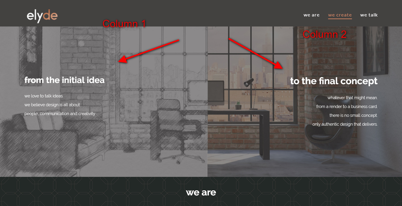
Sorry, that’s not the area I meant. I meant the last section of the website, not the first. The code did work though somehow, but I’ve still got the problem with the last column from that row (last section/we talk, row 2). The social media buttons look aligned ok in the cornerstone preview, however on the live website they are much lower down than the text on the previous two columns. Can you please help?
Hi @Amy209301,
Little confuse of the problem. would you mind sharing us a screenshot of what you meant here:
Same as your social media icons because I could see your site that it is working great already.

Let us know how it goes.
Thanks.
This topic was automatically closed 10 days after the last reply. New replies are no longer allowed.