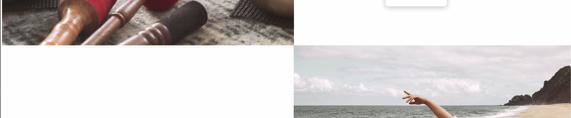
I would like the image in each section on my homepage to line-up with the very edge of the page and on the inside I would like the corners of the images to meet, no matter what screen size. As you can see from the first screen shot there is a bunch of white space on the sides and a gap between the images. When I make the screen smaller I can almost line them, as you can see in the second screenshot (just a little white on the left side). I’ve tried playing with the padding but it’s not consistent if I change the screen size. How can I make it so they line-up and stay that way no matter the screen size and in mobile version as well? 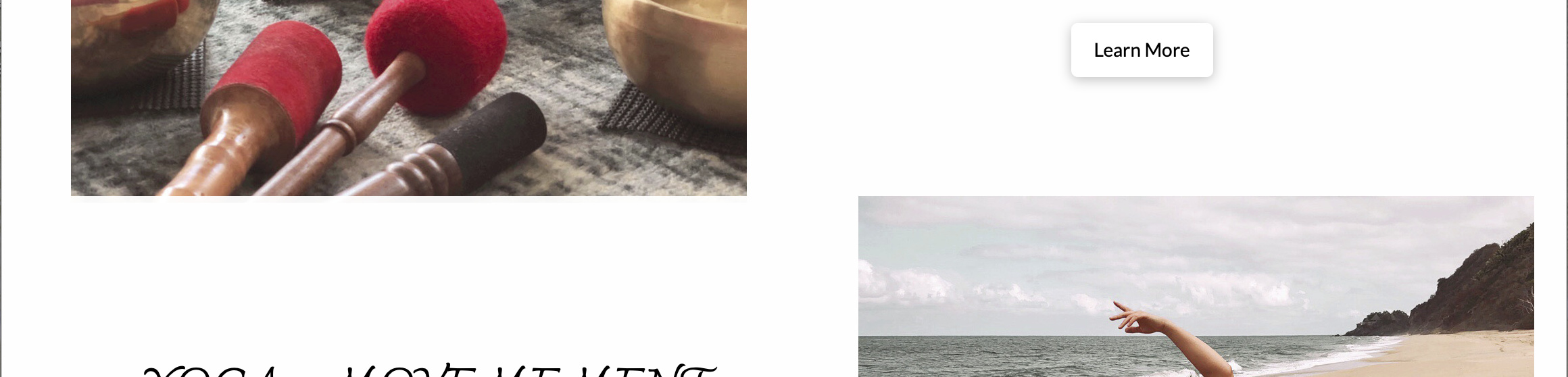
Hi Rachel,
Thanks for writing in! To remove those spaces between images and to line up them to the edge of the section, you can do as follows.
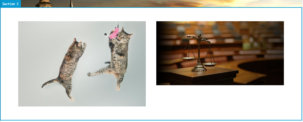
First select the Row that resides your images.
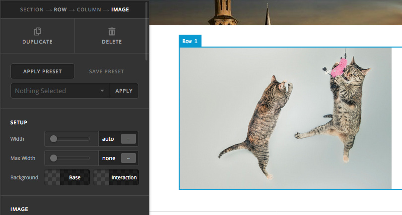
Then from it’s Setup options, you can enable Marginless columns.
Also you can can switch off your inner container.
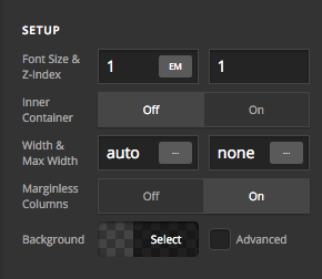
If you’re still having issues, please provide us with your example page URL to assist you further.
Let us know how it goes.
Thanks!
Thanks for your response, however I’m not looking to remove the space between images in one particular row. I only have one image in each row and the 2nd column has text in it (see first screenshot). When I turn off the container for the row, the image lines up with the edge of the website, but then so does the text in the 2nd column. When I make the web screen smaller the text ends up bleeding onto the image.
In each row, in the column that has the image, I would like it to lineup with the very edge of the screen (no white space) and in the column that has text I would like there to be a bit of white space between the text and the edge of the screen. And I want the corner of each image in each row to line up in the centre. Just like it is in the 2nd screenshot. The problem right now is if I change the size of the screen the white space around images and text between columns and rows changes. My site is currently offline in staging, so I can’t share it. But this website has a good idea of what I am trying to do. If you scroll down under Expect the Best you’ll see exactly what I am trying to do. Image on right, text on left. Next row has text on right and image on left, etc. https://evolveretreatco.com
Hi Rachel,
Yes, that should be the result similar to the side once you remove the spacing around them, just like in your provided screenshot. And achievable by turning off inner container and turning on margin-less option.
What I’m not sure is what is happening on your site so I couldn’t provide any answer. Is there a way you could setup an online copy of your site, but temporary?
Thanks!
This topic was automatically closed 10 days after the last reply. New replies are no longer allowed.