Align the Form

Hi there,

I have customised a raw content to create a newsletter form. The issue is I would like to make the form align with the generic format above. How can I do it? I changed the left padding to % but I think there should be a better effective way to code this.

Check out on this link.

Thanks

Hi @Symbiosis,

The width of the neswsletter is smaller than the content above. Removing the section padding should align it on the content above it. See this: https://screencast-o-matic.com/watch/cq6XQputff

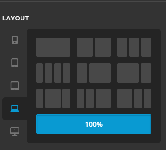
Note, another way of adjusting ROW width, available on the latest update is by inspecting ROW > go to LAYOUT TAB > Set the width of it per responsive breakpoint. No need to add padding to adjust width. Like what you have added, 20% and 15% right and left padding. On mobile device, those is too much and it will squeeze the content. Using LAYOUT TAB, we can actually set width per breakpoint/screen size.

Hope this helps.

Hi there,

It helps on the desktop screen. However, on mobile it jumped to overtake the previous row as seen in the screenshot.

Thank you.

Hello @Symbiosis,

Thanks for updating the thread.

I checked the website and can see that on mobile it’s overlapping previous section. To take a more closer look at the setup, can you please share login details in secure note?

Thanks.

Hi there,

I have added the credentials in the secure note.
Thanks for the help.
Cheers

Hi @Symbiosis,

Were you able to get this sorted?

I have checked Cornerstone and the frontend of your site and the form is aligned correctly in the column:

Please let us know in case you are still having any issue.

Thank you.

Hi there,

Yes I still have the same problem. I’ve just checked it on a Samsung Note 9 and it still is overlapping the previous section. Here is the screenshot.

Many thanks,

Hi @Symbiosis,

Thank you for the clarification.
That issue is because you have set custom height on the previous section to 0 on small screen. Please remove it. See this: https://screencast-o-matic.com/watch/cq6bQ2uz1e

Also note, you might also need to implement responsive headline on headers. I can see it is too large on mobile.
Add the selector without the dot on your headline class field.

Hope this helps.

Hi there,

My css code for the previous column height is 171 px which is not 0 if this what you meant. It is still overlapping to the previous section.

@media screen and (min-width: 481px) and (max-width: 767px) {
.e7-42.x-column.x-1-3 {
height: 171px;
font-size: 0.75em;
}
}
@media screen and (max-width: 480px) {
.e7-42.x-column.x-1-3 {
height: 171px;
font-size: 0.75em;
}
}

Re: the responsive headline on headers. I have removed the dot but seems nothing changed.

Kindly check.
Thanks.

Hi @Symbiosis,

You have added this code to the Element CSS of the Section 7 which is causing the issue:

@media (max-width: 767px){
     $el {
          height: 0px !important;
     }
}

Hope this helps.

Hi there,

Yes you are right. You fixed it. Many thanks

You are most welcome!

This topic was automatically closed 10 days after the last reply. New replies are no longer allowed.