Align text vs images

Hi!

I have a page: https://facepay.fastfingers.fi/

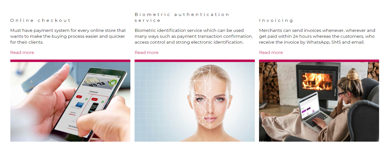
There are three image elements and above them is text. I would like to text to start even, but then I would like to align the images on bottom. I have tried to add the gap after the Read more text, but it´s a mess with all type of screens. Is that possible align the text part top and the image bottom? Any ideas how to make this look nice?

Hi @payapi,

Thank you for reaching out to us. To align the images and make it look better, Inspect your Row that contains the three columns and under Setup > Align Vertical, select End (see screenshot)

This will align your content including the bottom images:

Hope this helps!

Yes, I did tried this one as well. But not the text is not aligned on the top. This definitely is better than what I have at the moment. The best solution for my eyes would be the space between the Read more and the line. I suppose that is not easy to do?

Hey @payapi,

Adding a space between the read more and the line might not work as well because the content in your columns is not uniform and this may cause issues in different screen sizes.

Since the content is not uniform, there is no easy way to align the boxes dynamically and for all screen sizes, the solution suggested above is the closest that can be achieved dynamically and for all screen sizes. However an ideal solution is to make the content same in all columns i.e title, text content and the image.

Hope this helps!

Thank you, understand!

You are most welcome!

This topic was automatically closed 10 days after the last reply. New replies are no longer allowed.