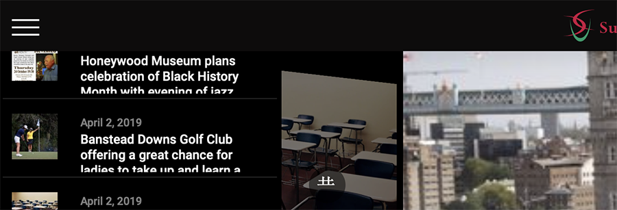
Align Superfly menu with Pro Shrink Header

Hello team,

I have this small issue that isn’t too noticeable but I was wondering if there is a setting to make the SuperFly hamburger menu button respect the variable padding of the Pro header.

I have many examples of this on my many Pro website where the Superfly alignment is set by superfly.

When using PRO header SHRINK the alignment has to be off one way or another which isn’t good on a typical shrink header.

Please see examples below:

Before scrolling
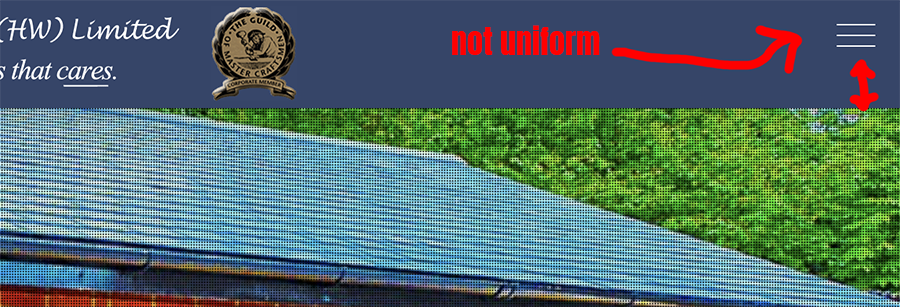
after scrolling and shrink.
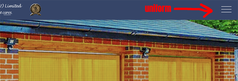
and so on…
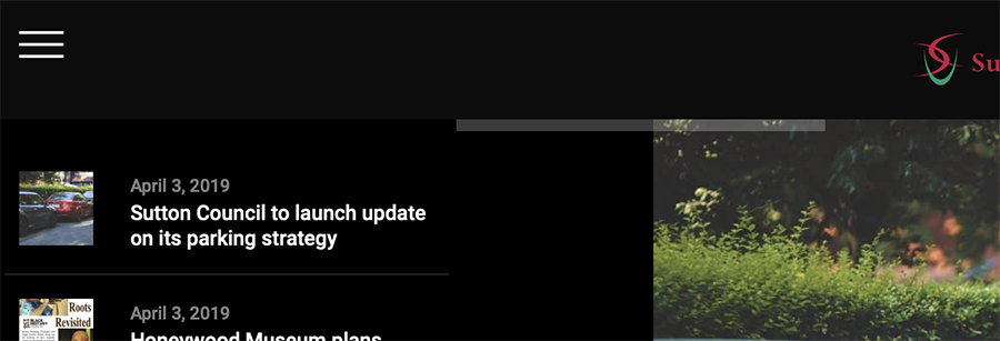
Shortcode to embed the superfly menu wherever you want to place it but I have seen no sign of a shortcode unless I’m mistaken?

Or perhaps a custom toggle rather than SuperFly’s toggle? Disabling the Superfly toggle button and using Pro theme’s button with Superfly’s CSS class?

Any help on this matter would be great. I believe this should be a standard feature in your settings seeing as a massive part of pro was the shrunk header and SuperFly has been with X since the near beginning. As one of your original customers from way back when - this is one of my pet peeves :slight_smile:

SO EDIT:

I’ve found this link: http://superfly.looks-awesome.com/docs/Customize/Custom_Menu_Trigger
Pretty much my 2nd suggestion. I have entered in my css selector i.d in Superfly being #custom_toggle

But the CSS to activate the superfly toggle isn’t working with the X.Toggle? Could you provide it for me?

Hi @j300bac,

I checked and there are multiple sites under your name. Can you provide us your site url . . This is to ensure that we can provide you with a tailored answer to your situation.

Thanks

Hey Paul, it’s all in the secure note :slight_smile:

Hi @j300bac,

Instead of using custom menu trigger, please use superfly button instead. We can use css and js script to align it properly with your PRO Header.

For the initial position of your button, you can adjust alignment under the superfly button settings.

Then to adjust the alignment on shrink, add the code below in Theme Options > JS

jQuery(function($){

	$(window).scroll(function(){

		if( $(this).scrollTop() > 0 ) {
			$('.sfm-navicon-button').addClass('adjust-top');
		}else {
			$('.sfm-navicon-button').removeClass('adjust-top');
                                  }

	});

});

Then add this in Theme Options > CSS

.sfm-navicon-button.adjust-top {
    top: 50px;
}

You may change 50px to adjust alignment

Hope this helps

You sir are an absolute diamond! This has fixed so many of my sites with X and Pro :slight_smile:

I have one more thing that I could use help with regarding Superfly and Pro if possible -

It gives the option to block on certain pages which is great and also block on mobile or desktop. But there’s an option function that it doesn’t have which I need.

I need to block the menu on the homepage desktop and tablet only but I would like for it to appear on mobile 480px and below when my other Pro buttons are hidden. This is for the homepage only on the site given.

Homepage desktop and tablet - hidden
Homepage mobile - visible

If you have any suggestions for this I would really appreciate it :slight_smile:

Hi @j300bac,

To achieve that, you can add the code below in Theme Options > CSS

.home .sfm-navicon-button,
.home #sfm-sidebar,
.home #sfm-overlay-wrapper {
      display:none;
}

@media(max-width:480px) {
.home .sfm-navicon-button,
.home #sfm-sidebar,
.home #sfm-overlay-wrapper {
      display:block;
}
}

Hope that helps

This topic was automatically closed 10 days after the last reply. New replies are no longer allowed.