Hi X Team,
Please see the pricing menu on this page… http://defensepest.bluetroop.com/. What coding trick can I use to cause all the Buy Now buttons to align evenly at the bottom of their columns? Thank you in advance.
Hi @bluetroop2,
Thanks for reaching out.
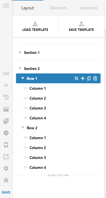
To put the Button in the bottom of the column, you need to add two different rows with each containing 4 columns, first row will contain the content part of each column, and the second one will contain the Button.
Your structure will look like the screenshot, the columns of Row1 in the screenshot will contain the content part, and the columns of Row2 will contain the Button.
Hope that helps.
Thanks
Okay, thank you, will do.
On another item (same web-site) for the top logo/navigation area. On this web-site - https://gritprod.com, your team helped me achieve the desired look… logo centered and two nav selections on either side. The same code does not work on this new web-site. Can you assist? Thank you!
Also, the navigation selections enlarged on hover.
And one more question on the original topic with the buttons. If I spilt all the buttons out in their own row, what will happen on mobile screens. How do I cause the button they select to go with the price package they want?
Hi @bluetroop2,
To your original topic, on mobile devices, the row of buttons will appear at the bottom of all the pricing table, in a different row. To make that buttons just under each pricing table add the same button just under the text and make that visible only on mobile by using the Hide During the BreakPoint option.

And make the row with buttons invisible in the mobile device by using the same.

For your queries on other sites, I would request you to create a new Thread on that to provide the solution without any confusion.
Hope it helps.
Thanks
Okay, Thank you.
You are most welcome!
This topic was automatically closed 10 days after the last reply. New replies are no longer allowed.