Align 3 icons horizontally on mobile

Hey Guys,
I hope i can explain my “issue” properly so that you understand.

On my site https://casinoorbit.com/ - under “KOMBINERA EN BONUS MED NÅGRA AV DE MEST SPELADE SPELEN”

i have 6 images, with 6 small logos underneath aligned horizontally, I’m using the “row tool”

But on mobile, the 6 small logos/images stack on top of each other.

Could you guys please help with a CSS code that will horizontally align the small 6 images on mobile?
Hello Niklas,

Thanks for writing in!

  • Please inspect column that’s holding images and text elements.
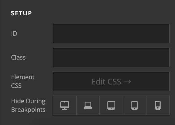
  • Under Customize > Setup > Class add a class name.

  • Next, add following CSS under X > Theme Options > CSS:
@media only screen and (max-width: 600px) {
  .class-name {display: table-cell !important;width: 25% !important;}
}

Change class-name with your own as per requirement.

Thanks.

1 Like

awesome!!! thanks alot

Almost there, some of them alights correctly on phone, some does not, hmm

Hi Niklas,

Please remove the class hora on your columns. And add that class on the nested ROW instead. nested ROW is the ROW that is inside a Column. Do not add the class hora on the ROW that is a direct child of the Section.

Nested ROW is the container of your icons.

After you do that, please update the given CSS code to this:

@media only screen and (max-width: 767px) {
  .hora {
  	display: table !important;
  }
   .hora .x-column.x-1-3 {
   	display: table-cell !important;
  	width: 33.33333% !important;
   }
}

Let us know how it goes,
Cheers!

1 Like

Beautifull!!!
Thank you so much guys!

You’re always welcome Niklas!

Cheers.

This topic was automatically closed 10 days after the last reply. New replies are no longer allowed.