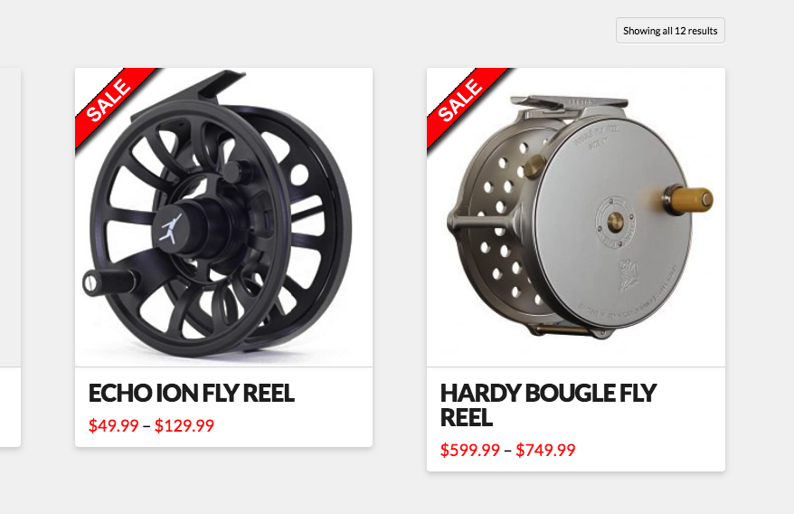
Folks, I’m wrapping up a client site and one of the last nitpicks is the layout of the search results. See the link below:
https://www.coastsportfish.com/?s=reels&post_type=product&dgwt_wcas=1
As you can see, we have the “For Sale” badge basically obliterating the image. Also, the “Select Options” link that appears, and the clickable link that is the name of the product, only work when you hover over the right-hand portion of either when the sale badge is on display.
I’d like to do the following:
- Show the image larger.
- Have the “Select Options” button appear lower.
- Have the clickable text always clickable (which likely means putting it a bit lower).
Essentially, I need a solution that doesn’t block out the image and doesn’t restrict where the link and the button can be clicked.
Any ideas? Thanks!