Adjusting space in text element on Pro header

Hi again,

Trying to adjust the space inside a text block and the margins around it in a Pro header, specifically on an Ipad landscape view. (max width 1025px) At the moment in the Ipad landscape view some of the names of the menu items are starting to get cut off because of a lack of space but the text block has plenty of room around it so I’d like to move it to the left a bit and reduce the space on the right.

Screen shot is attached and here is the url: http://u2k.db4.myftpupload.com/contact/

Thanks for all the help!
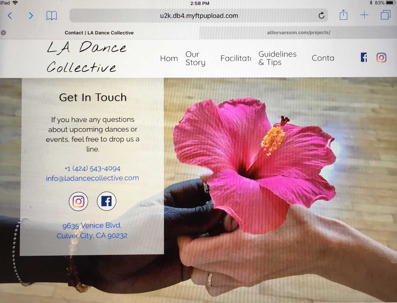
Hi There,

Thank you for writing in, would you mind providing us login credentials in a secure note so we can take a closer look on your header configuration,

Cheers!

Yeah added them to the secure note above.

Hi,

Try to set your menu Self Flex to No Shrink

and add a min width to your social icons.

After that, you need to set your mobile button visibility to appear earlier.

Hope that helps.

Great, that did help, thx!

One more thing: I am trying to control the size of the top link fonts and also the margins around the logo as the screen gets larger, so that there are two different sets of margins and font sizes for screens above 1200px and for those below.

But right now, when the media queries kick in at 1200px the min-width for the instagram social icon gets overridden and it dissappears then slowly enlarges as the screen size gets bigger.

I would like for it not to get overridden but instead to remain set at a minimum of 20px and it’s fine if the text block shifts to the left a bit to accommodate it.

Hi,

You can add a class to your icon.

Then add this in Header > CSS

@media(max-width:1200px) {
      .my-instagram,
      .my-instagram img {
          min-width: 20px !important;
          width:20px !important;
      }
}

Hope that helps.

This topic was automatically closed 10 days after the last reply. New replies are no longer allowed.