Hi. There’s a video in my post that has a huge space between the video and caption when viewed in mobile. It looks find on desktop.
How can I adjust this space for mobile view only?
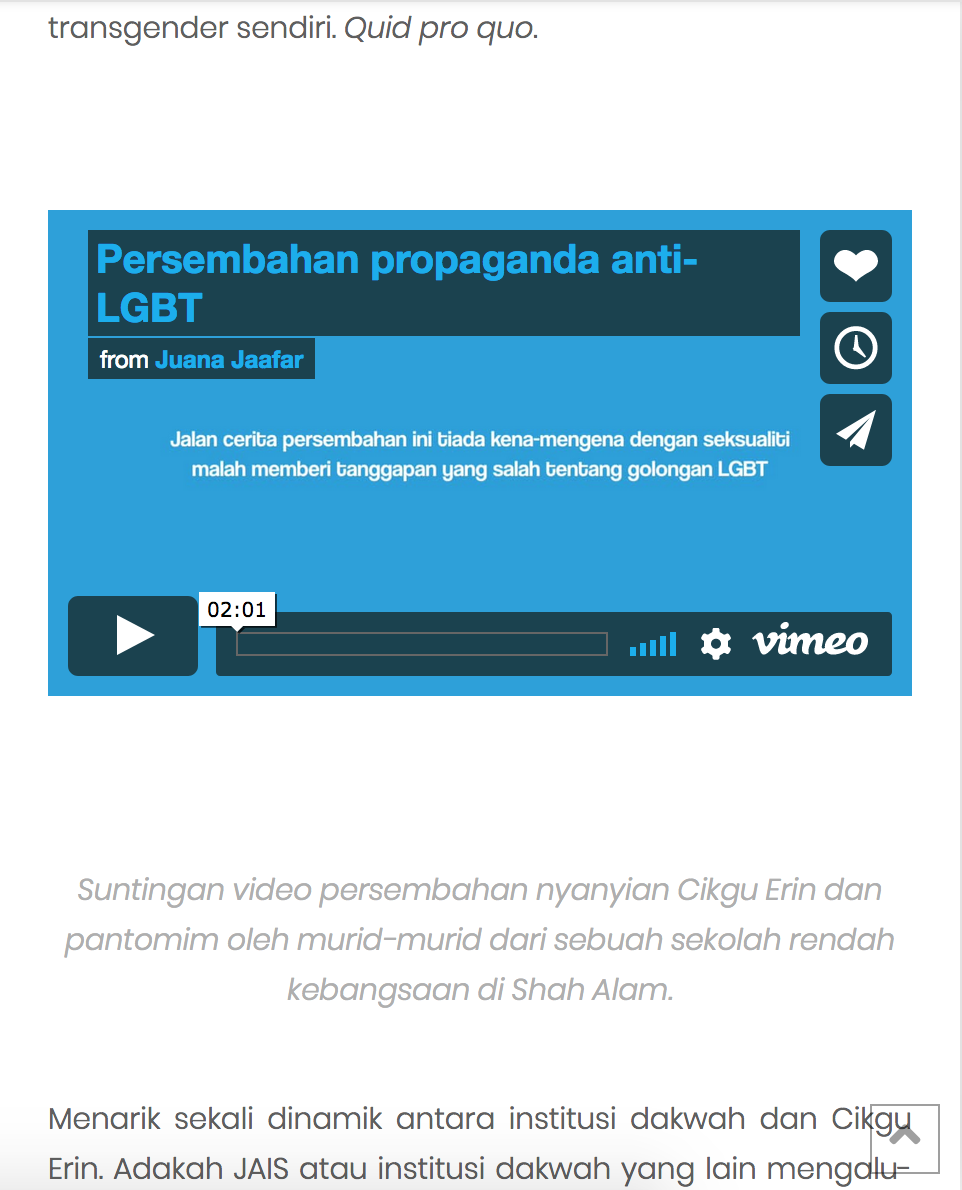
Hi. There’s a video in my post that has a huge space between the video and caption when viewed in mobile. It looks find on desktop.
How can I adjust this space for mobile view only?
Hello Jaafar,
Thanks for asking. 
You can add following CSS under X > Theme Options > CSS:
.entry-content iframe {
    height: auto !important;
}
1- I have found the proper CSS code selector using the Chrome browser Developer Toolbar: https://www.youtube.com/watch?v=wcFnnxfA70g
2- For the CSS code itself, I suggest that you get started with this tutorial: https://www.youtube.com/watch?v=yfoY53QXEnI
Thanks.
I inserted the code and while the caption space was resolved, it changed the size of the video to small (see pix). I want the video to remain as it was.
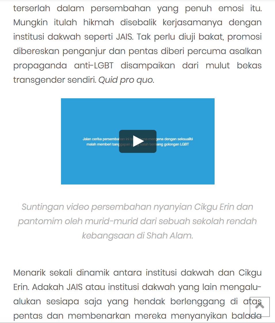
Hello Jaafar,
Thanks for updating the thread.
Please add following CSS under X > Theme Options > CSS :
@media only screen and (max-width: 600px) {
    .entry-content iframe {
    height: 200px;
}

}
Thanks.
This topic was automatically closed 10 days after the last reply. New replies are no longer allowed.