Adjust UberMenu Responsive Menu Spacing/Text Sizing

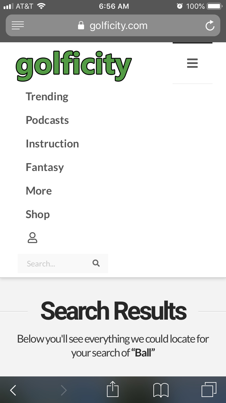
For some reason the menu items on my responsive mobile menu are too spaced out (vertically) which causes some of the items go float below the menu. How can I make the menu sizing and spacing scale smaller on moble.

Here is a mobile screenshot.

My website is located at https://golficity.com.

Thank you

Hello @Frank19,

Thanks for writing in! Did you added some padding for the menu items? Please add this custom css to reduce the amount of spacing in smaller screens.

@media(max-width: 767px){
  .ubermenu-main .ubermenu-item-level-0 > .ubermenu-target, 
  .ubermenu-main .ubermenu-item-level-0 > .ubermenu-custom-content.ubermenu-custom-content-padded {
    padding-top: 8px;
    padding-bottom: 8px;
  }
}

We would loved to know if this has work for you. Thank you.

This did help. Can you tell me if there is a way to make the last menu item (search bar) extend wider? Almost to full width of the mobile menu?

Hi,

Sorry not exactly sure what you want to achieve. I checked and it seems to be wide already?

Can you provide us a screenshot on how it looks in your end.

Thanks

Sorry, you might be seeing an older cached version. It looks like this:

Wondering if there is a way to make that search bar wider within the mobile menu.

Thanks.

Hi Frank,

Can you try adding the following CSS media query into your X -> Theme Options -> CSS area and see if that helps.

@media (max-width:480px){
  .ubermenu .ubermenu-search .ubermenu-searchform {
    width: 100%;
  }
}

Make sure to clear all cache before testing (refer: https://www.wpbeginner.com/beginners-guide/how-to-clear-your-cache-in-wordpress/).

Thanks!

That appears to have done the trick. Thank you!

You are most welcome. :slight_smile:

This topic was automatically closed 10 days after the last reply. New replies are no longer allowed.