Hello, please, I need help, how can I adjust the size of the boxes or small windows, like the big orange box, and two and two, one up, one down, one up, another down, thank you!
Hi @maximuzve,
Did you mean to change the number of columns on small windows?
Please try with the following CSS:
- 3 columns on small windows:
@media (max-width: 767px){
    .x-iso-container.cols-3>.hentry {
        width: 33.28% !important;
    }
}
@media (max-width: 480px){
    .x-iso-container.cols-3>.hentry {
        width: 49.95% !important;
    }
}
@media (max-width: 320px){
    .x-iso-container.cols-3>.hentry {
        width: 100% !important;
    }
}
- 2 columns on small windows:
@media (max-width: 767px){
    .x-iso-container.cols-3>.hentry {
        width: 49.95% !important;
    }
}
@media (max-width: 480px){
    .x-iso-container.cols-3>.hentry {
        width: 100% !important;
    }
}
Hope it helps 
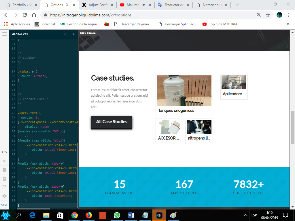
hello friend many, it did not help me 
I want the boxes in big size in column of two friend
Hi Alberto,
I am sorry but I am not exactly sure what you are trying to achieve.
Can you provide as a drawing or screenshot of what you want it to look like.
Thanks
1 Like
of course my friend
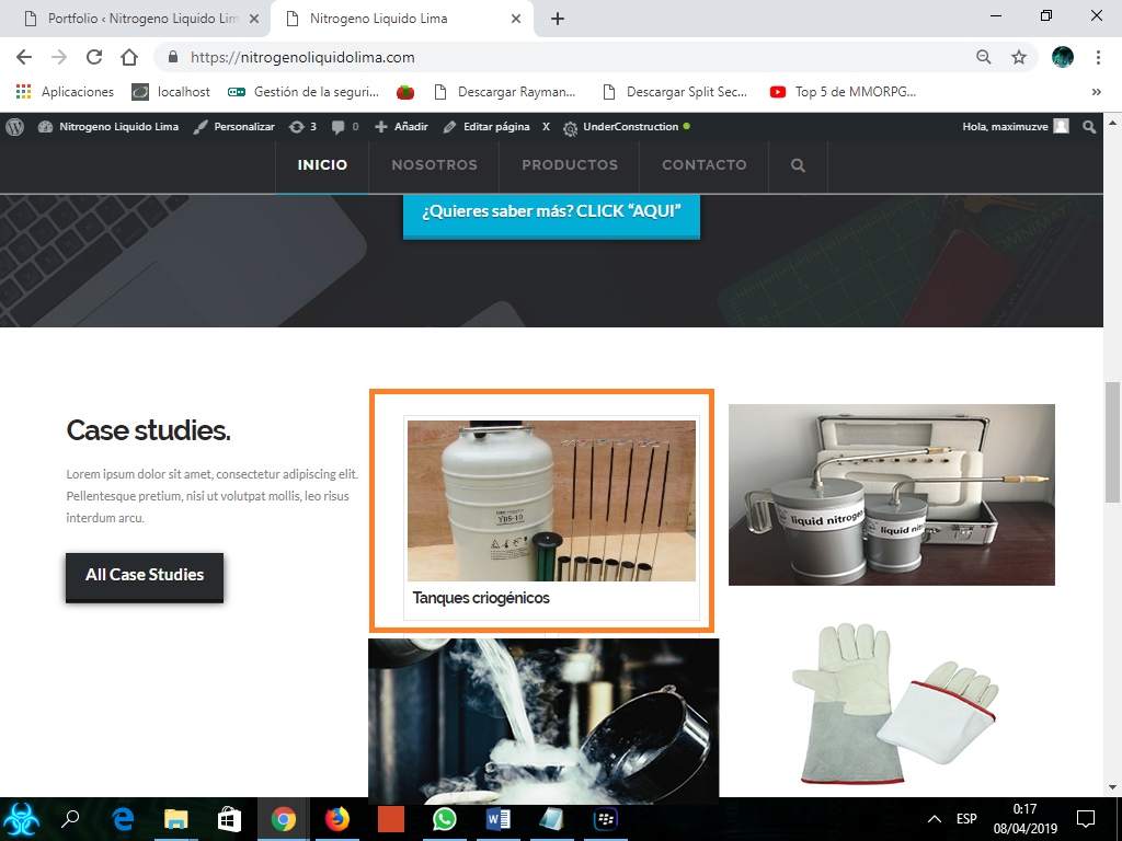
I want it to look like this
Hi Alberto,
To achieve that, you can add the recent post element for your column 2 and column 3 in vertical orientation.

http://demo.theme.co/integrity-1/shortcodes/recent-posts/
Hope this helps
1 Like
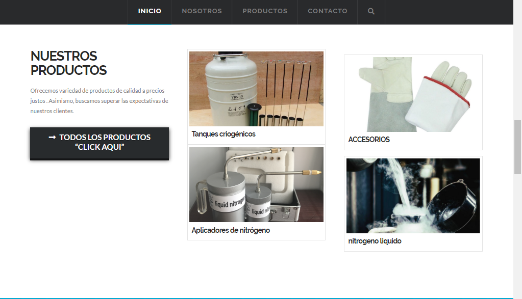
thank you very much friend, you can solve it thanks to you. 
You’re welcome!
1 Like
This topic was automatically closed 10 days after the last reply. New replies are no longer allowed.