Adjust page background image

Hello ThemeCo Team,

I have created a visual effect where my nav bar is transparent and lays over a blurred image background on all the pages of my client’s site except for the homepage. I’ve done this by setting a page background image, and with some CSS to put the nav bar on a transparent background and then have that background turn black when the user starts to scroll. The effect is working nicely except for one issue. The image that I am using on each page for the page background is being blown up and stretched across and down the entire page. I really only need it to be in the upper third of the page, if that, but I cannot figure out a way to do that. I don’t really like how the image background is looking when it is stretched across and down the entire page. Is there a setting I can adjust or some CSS I can use, or some other way I have not thought of to have the image just at the top of the page background?

Thanks
Rayna

Example page: http://dev.asv1.com/clients/

I’ll include my credentials in a private response.
hi There,

Thanks for the details!

I have added this css to your custom css it should work for your every pages!

.backstretch img {
  width: auto !important;
  height: auto !important;
  left: 0px !important;
}

Please check and confirm in your end.

Thanks

Thanks Basanta!

That completely solved the problem. However, it has created a problem on only one of my pages. Now, on the Our Work page, there is something weird going on with the header I created, which contains the page title. It is doing some weird parallax thing that is not showing the entire header as it should. The header area should look just like the other pages (Contact is an example of a page where the header looks correct). The Our Work page and the Contact page, for example, are built exactly the same way. The only difference I can see is that the second section in the Our Work page contains an Essential Grid grid. Can you help me figure out what is going on with the Our Work page since you added the above CSS?

You have my site credentials. Here’s a link to the Our Work page: http://dev.asv1.com/our-work/

Thanks!
Rayna

Hi There,

Thanks again for updating!

I have done few changes in the old CSS and now it should work fine in your work page.

Let us know if we can help you in anything else.

Thanks

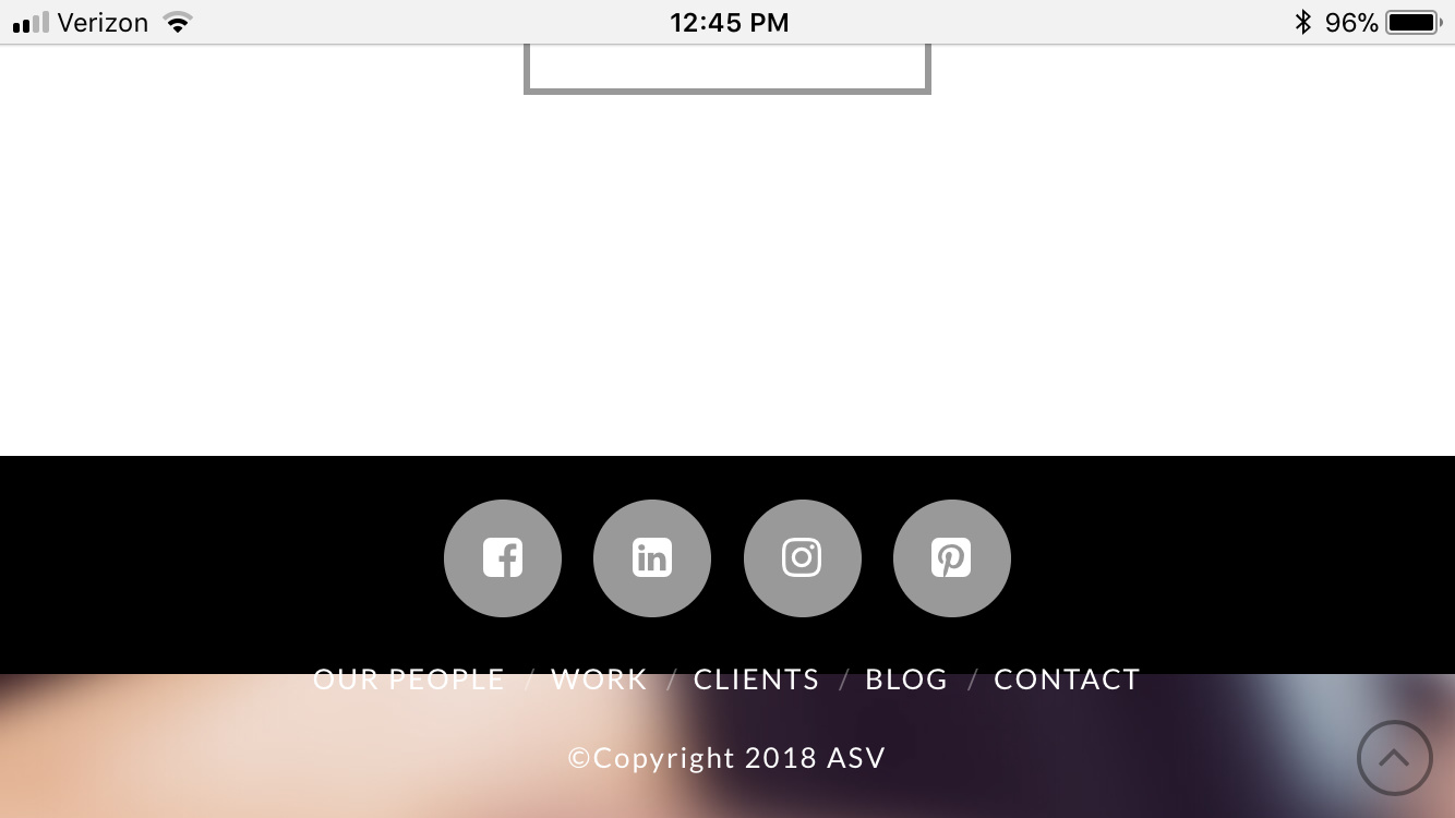
Thanks for your efforts Basanta. While you solved the issue I mentioned, now there’s a new issue. The background image of the Our Work page is now very blown up, so it looks weird at the top, and on mobile (iPhone 6 portrait view) the footer is messed up - the blue color from the page background image is showing a lot, the footer container seems to have shrunk in height, and now the footer links are hanging over onto that blue background. I have attached a screenshot. This same footer problem now exists on all of the pages when viewed on mobile - and in landscape view, the page background image is showing below the footer. I’ve attached screenshots of the Contact page to show you an example of that.

Thanks for looking into it,
Rayna

Basanta,

I was able to resolve the mobile footer issue by adding the following CSS to the Additional CSS field in the Customizer:

@media screen and (min-width: 768px) {

.x-colophon.bottom {
padding: 0px 0! important;
}
}

@media screen and (max-width: 767px) {

.x-colophon.bottom {
padding-top: 100px ! important;
padding-bottom: 140px !important;
}
}

I was also able to resolve the page background issue mentioned in my last message by adjusting the height in this CSS that you had entered for me from 700px to 440px:

.page-id-2509 .backstretch img {
width: auto !important;
height: 700px !important;
left: 0px !important;
}

So I think I am all set! Thanks for all of your help! I love learning new things :smile:

~Rayna

Glad you’ve sorted it out :slight_smile:

This topic was automatically closed 10 days after the last reply. New replies are no longer allowed.