Add Telephone Number to Navigation Bar

Can you help me with adding our Telephone number to the Navigation bar. This way as a person scrolls down it is always visible on the screen. Currently, we have our logo on the left, then our menus. Trying to see a way for the phone number to be list on the right side of the menus. Our website is: bluestreakcourier.com. As a note this would only be for desktop versions. I am not sure if there is a way to get the phone number to stay at the top of the screen as one scrolls for mobile version.

Any help would be greatly appreciated.
Thank you.

Hi @BSWebDev,

Thanks for reaching out.

Unfortunately, I couldn’t access your site, I’m blocked by Godaddy firewall. Please deactivate it first and let us know.

You could also try ConvertPlus’ infobar then just deactivate it from mobile

Cheers!

What country are I need to open up for you. Thank you

Hi there,

The staff are in different countries so we cannot provide and specific country to unblock as it would also be another staff member that will handle the ticket next time who is in another country.

Is there a chance that you can temporarily disable the IP blocking option so that we can check it?

Thank you.

I have temporarily removed the blocking. Please review as soon as possible. Thanks

Hi @BSWebDev,

Looks like it has multiple security firewall, now it’s displaying the firewall from Succuri.

Please deactivate it as well, and any other security that will possibly block access from other countries :slight_smile:

Thanks!

I just disabled the GEO blocking that we are doing. So please try again. thanks

Hello BlueStreak,

Thanks for updating in!

The phone number cannot be added in the right side of the menu items because as the screen gets smaller, that space will also get smaller. I would recommend that the topbar should be fixed on top so that both in desktop and smaller screens, the topbar will display along with your fixed navigation.

To be able to make the topbar as fixed, please add this JS code in the Theme Options > Global JS (http://prntscr.com/evswzb)

(function($){
    $(document).ready(function(){
        $('.x-topbar').prependTo('.x-navbar');	
    });
})(jQuery);

We would loved to know if this has work for you. Thank you.

I will try that out in the morning, is there a way to make the phone number be in the right side instead if the left.
also on the mobile version will this stay at the top or scroll off as you scroll down. currently on mobile, the navigation bar scrolls off.
i would like to have it stay on screen all the time…

thank you

Hi,

  1. to make it appear on the right side, you can add the code below in Theme Options > CSS
-topbar .p-info {
    float: right;
    margin-left:20px;;
}

  1. To make it fixed it mobile , you can add the ocde below inTheme Options > CSS
@media (max-width: 979px) {
.x-navbar-fixed-top {
    position: fixed;
}
}

Hope that helps

Please use the URL: http://1hu.e0f.myftpupload.com to view the changes (test server). You can compare this to my production site at: bluestreakcourier.com
Issue: When I use the code to keep the Navbar fixed at the top. It is making the next section shorter. (whether it is the slider on the first page or cutting off entirely the page name header on the other pages. Is there a way to keep the navbar at the top, but also not to cut into the size of the next section being displayed. I

Also I do have an additional question below.

  1. The information with the Phone Number also has a login link. Is there a way to keep the Login Prompt on the left and move just the Phone number to the right and have the social media in the middle?
    Any additional help would be greatly appreciated.
    Thank you for the help.

Hi,

Please replace the second code with this

@media (max-width: 979px) {
.x-navbar-fixed-top {
    position: fixed;
}
.masthead.masthead-inline {
.    height: 135px;
}
}

For your additional question, you can try changing your code i the topbar with this

<span style="float:left;"><a href="https://vf.bluestreakcourier.com/xcelerator/clientportal" target="_blank" style="color: rgb(255, 255, 255); text-decoration: none; outline: none;"><i>Log In</i></a></span>

<span><a href="https://www.facebook.com/BlueStreakCourierService/"><i class="x-icon-facebook-square" data-x-icon-b="" aria-hidden="true"></i></a></span>

<span style="float:right;"><a href="tel:1-610-935-1999" style="color: rgb(255, 255, 255); outline: none;"><i>1.610-935-1999</i></a></span> 

Then change this code

.x-topbar .p-info {
    float: right;
    margin-left:20px;;
}

with this

.x-topbar .p-info {
    width:100%;
     text-align:center;
}
.x-topbar .x-social-global {
    display:none;
}

Hope this helps

So only made one change so far. To resolve the issue with the information being cut off at the top of the screen. I made just the change below:
@media (max-width: 979px) {
.x-navbar-fixed-top {
position: fixed;
}
.masthead.masthead-inline {
. height: 135px;
}
}

Mobile - it is fine for initial loading but then has issues when you scroll back up. It is not there.
Desktop - It only partly shows the Title for each page. loosing about one third of it.
Please advise.

I am not going to try the other stuff till this issue is resolved.

Thanks

Hi @BSWebDev,

The correct CSS should be this without extra dot

@media (max-width: 979px) {
.x-navbar-fixed-top {
position: fixed;
}
.masthead.masthead-inline {
height: 135px;
}
} 

Then add this CSS for desktop fix

@media ( min-width: 980px ) {
.masthead.masthead-inline {
height: 128px;
}
}

Hope this helps.

Thank you, those items did take care of what I.
As for the other part about moving the facebook icon into the middle. In the code below:

Are there other facebook symbols to use? That symbol is a little hard to see.
Thank you again for all the help.

Hi again,

You can use an alternative one:

<i class="x-icon-facebook" data-x-icon-b=""></i>

There are only 3 icons available for Facebook, you can see here https://fontawesome.com/icons?d=gallery&q=facebook

However you can change the color of the icon and it’s size to avoid the visibility issue by adding the following code in the Theme Options > CSS:

.x-icon-facebook, x-icon-facebook-square {
    font-size: 45px;
    color: red;
}

Change the color and font-size as per your need. To see all icons you can visit https://fontawesome.com/cheatsheet

Hope this helps!

I have tried this out on my staging server and have done what you suggested. Is there a way to make the item change color when mousing over it, same for the Phone number and Login at the top of the page?

Secondly, is there a way to create a second line on the footer below where we have the copy write / address?

Thank you for all your help and suggestions.

Hello Blue Streak,

Thanks for updating in!

  1. Please have your topbar content updated and use this:
<p class="p-info">
	<span style="float:left;"><a href="https://vf.bluestreakcourier.com/xcelerator/clientportal" target="_blank" ><i>Log In</i></a></span>

	<span><a href="https://www.facebook.com/BlueStreakCourierService/"><i class="x-icon-facebook" data-x-icon-b="&#xf082;" aria-hidden="true"></i></a></span>

	<span style="float:right;"><a href="tel:1-610-935-1999"><i>1.610-935-1999</i></a></span>
</p>

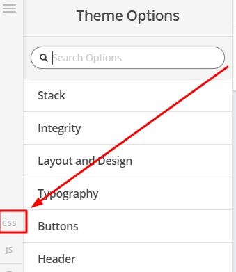
And then you will also add this custom css code in Theme Options > Custom CSS

.x-topbar .p-info a {
	font-family: Helvetica, Arial, sans-serif; 
	font-size: 18px; 
	color: #ffffff;
}

.x-topbar .p-info a:hover,
.x-topbar .p-info a:hover > * {
	color: red;
}
  1. You can add a second line in the footer content by modifying your content text. Have it updated and insert this:
<p><span style="font-size: 13px; line-height:16px; color: #ffffff;  font-family: Helvetica, Arial, sans-serif;">© 2018 Blue Streak Courier Service Inc. P.O. Box 993, Valley Forge, Pa 19482 <a href="tel:1-610-935-1999" style="color:#ffffff;text-decoration:none;">1.610-935-1999</a> <span style="font-family: Helvetica, Arial, sans-serif; font-size: 18px; color: #ffffff;"><a href="https://www.facebook.com/BlueStreakCourierService/"><i class="x-icon-facebook" data-x-icon-b="&#xf082;" aria-hidden="true"></i></a></span></span></p>

<p>Add your second line here</p>

Please do not forget to insert the text for the second line.

Issue with the above code, is that it makes the height of that toolbar almost double what it is currently. I would like it to remain the same height as it is.

A different question about the Facebook icon. Is there away to get the bottom of Facebook to be level with the other text in the toolbar? Currently the bottom of the icon site below the line. level with the bottom of the lowercase g in the word Login. Any Suggestions on a way to adjust that?

When mousing over the number at the bottom of the page, how would I get that item to change color?
Also, what is the name of the section in the footer where our company address is located at?
Is there some documentation online that would have the that type of information listed?
Thank you again for all of the help. It is teaching me a bunch.

Hi @BSWebDev,

The firewall is up again and can’t access it. I couldn’t recommend any as I’m not sure how it’s currently looked-like now. Please deactivate the firewall again.

Thanks!