4.0 Pro UI Inconsistent breakpoint icons

I’m hoping there’s a setting somewhere for me to make all the breakpoint icons consistent; from left to right, largest to smallest. Essentially, back to how it was in the previous version.

If not, I’d like to request that the breakpoint preview icon order be made consistent with the hide breakpoint icons in the customizer. Thanks!

Hi @WaggingLabs,

A few hours ago, we have released another version i.e. 4.0.6, it has some issues fixed already. Please update your theme to that version. If you are still experiencing the same issues, please provide login credentials for your site in a secure note to examine it further, including:

– WordPress Site URL & Login URL
– WordPress Admin username/password

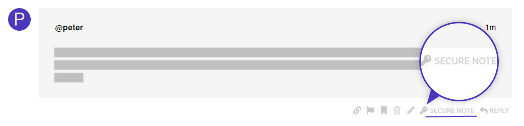
To create a secure note, click the key icon underneath any of your posts.

Thanks

Hi @tristup - My issue is that the order of icons varies within the theme.

I updated to 4.0.6., but this isn’t really a bug — it’s an oversight in the user interface. If the desire was to have icons go from mobile to desktop in 4.0, let’s make that a global change in UI. Not just one location.

I understand this is more of a request to the developers, not a support ticket. Please let me know if I should report this elsewhere or if you can flag it for review.

Everything about this upgrade is awesome. I can work around bugs and update the theme as needed. This issue is apart from that.

Thank you.

Hello @WaggingLabs,

I have forwarded your feedback to our developers already. This is something that they can double-check for consistency or at least respond to you why they have made such changes.

Please bear with us. Thank you.

Thanks @ruenel! :slight_smile:

You’re most welcome!

This topic was automatically closed 10 days after the last reply. New replies are no longer allowed.