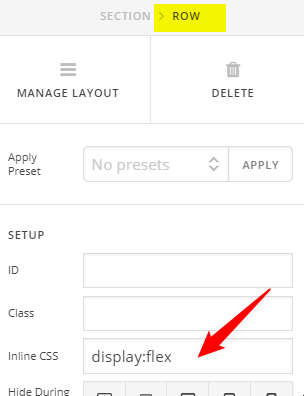
I’m trying to have 3 columns show side by side in mobile view. I currently have the styles below assigned to each column, but the third column isn’t quite aligning correctly. Thoughts?
Left column style - width: 25%; float: left;
Center column style - display: block; margin-left: auto; margin-right: auto; width: 25%;
Right column style - width: 25%; float: right;