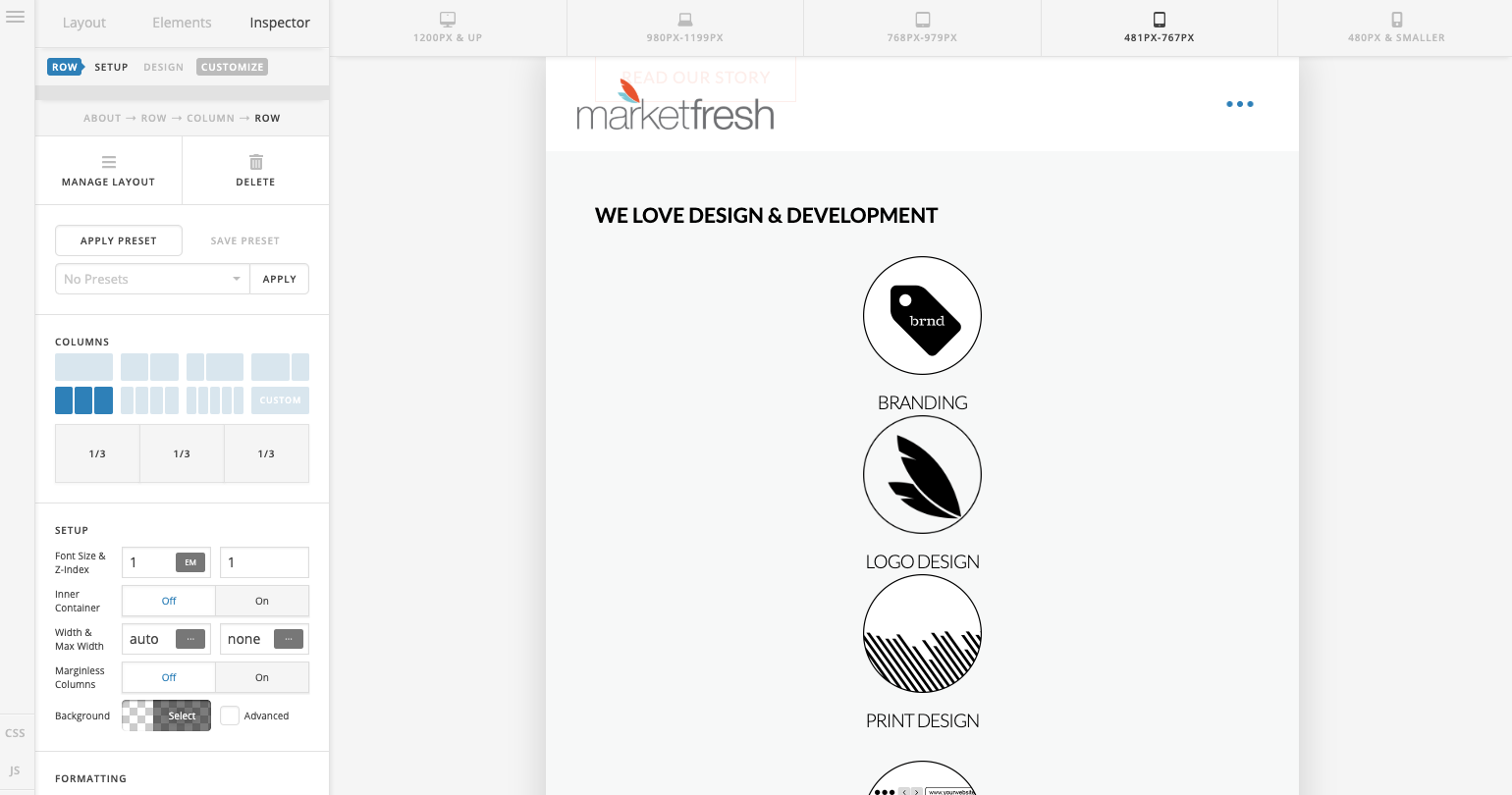
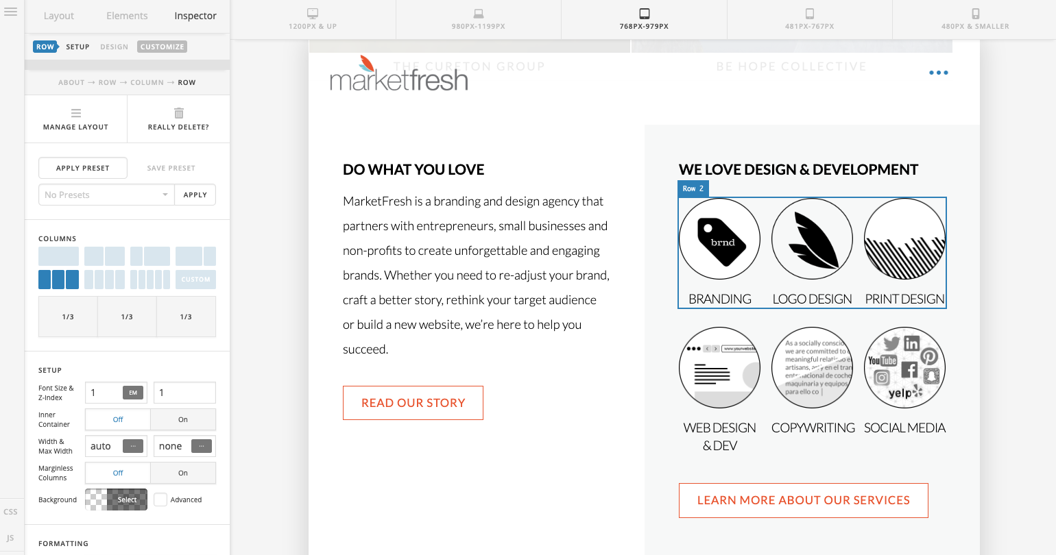
I have a 2 column row, and then in one of those columns I have a 3 column row.
At the first mobile breakpoint I’d like for the 3 column row inside the 2 column row to remain 3 columns. Is there an easy way in the interface to make this happen instead of css overrides?
Hi Jonathan,
Thank you for reaching out to us. Custom CSS will be needed in order to achieve this. Give your Row a class e.g maintain-layout that has three columns then you can add the following code in the Theme Options > CSS:
@media screen and (max-width: 767px) {
.maintain-layout > .x-column {
width: 32%;
margin-right: 2%;
display:inline-block
}
.maintain-layout > .x-column:last-child {
margin-right: 0;
}
}
Hope this helps!
This topic was automatically closed 10 days after the last reply. New replies are no longer allowed.